
This semester really opened my eyes to the amount of time and effort that goes into creating all the visual aspects of this world. I have really enjoyed learning about what grabs peoples attention, how to use colors, layouts, lines and photos effectively, and overall, just how to create a clean and well designed product. It has been nice to have a new level of creative freedom that is not given with a lot of classes. Its also been an interesting challenge to continue being innovative and think of new ways of presenting things. I think this class has taught me an enormous amount over the past 15 weeks and will hold me in good stead as I continue to develop my skills and abilities.
Author Archives: Holly Johnston
iPad Design
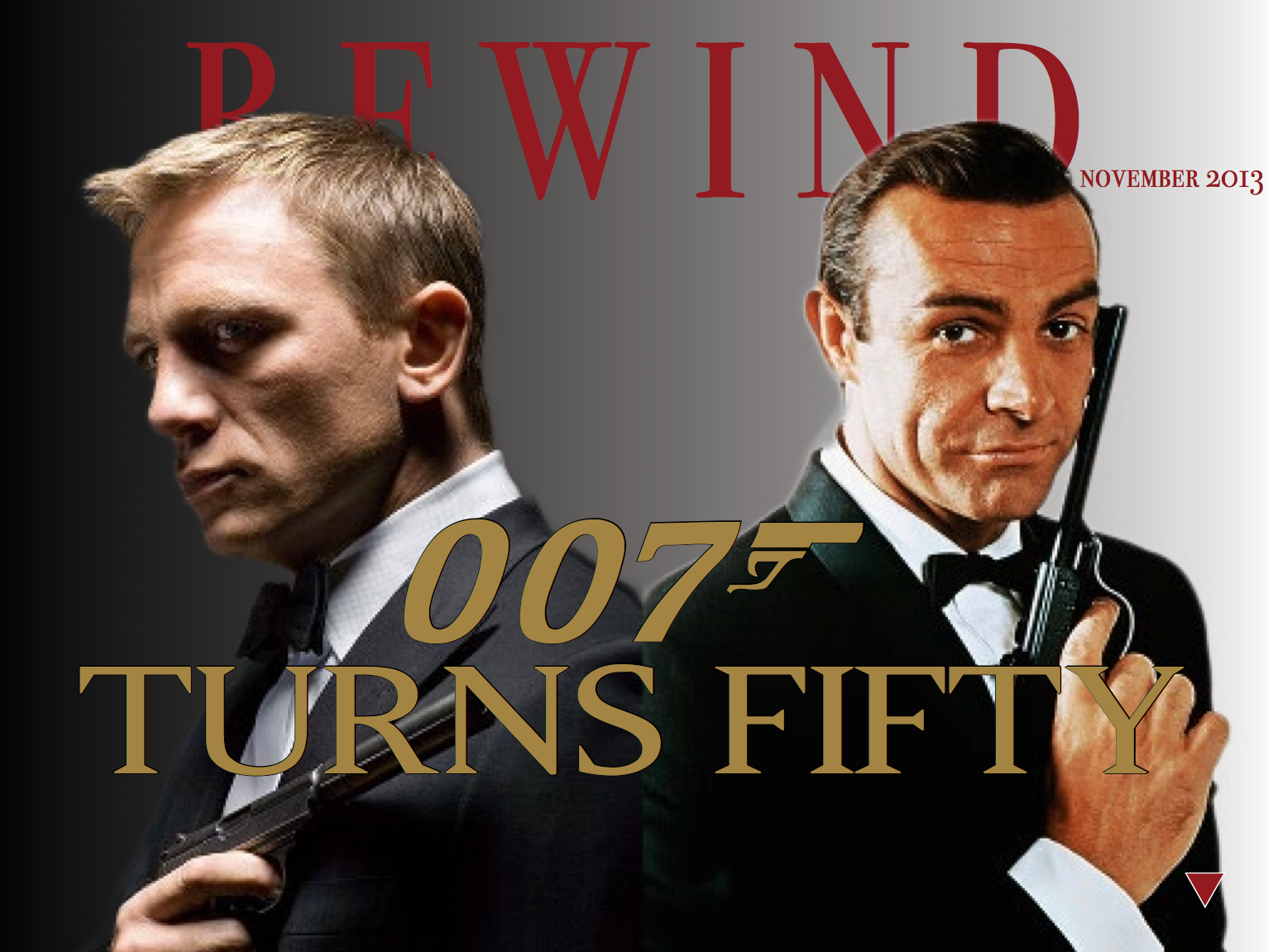
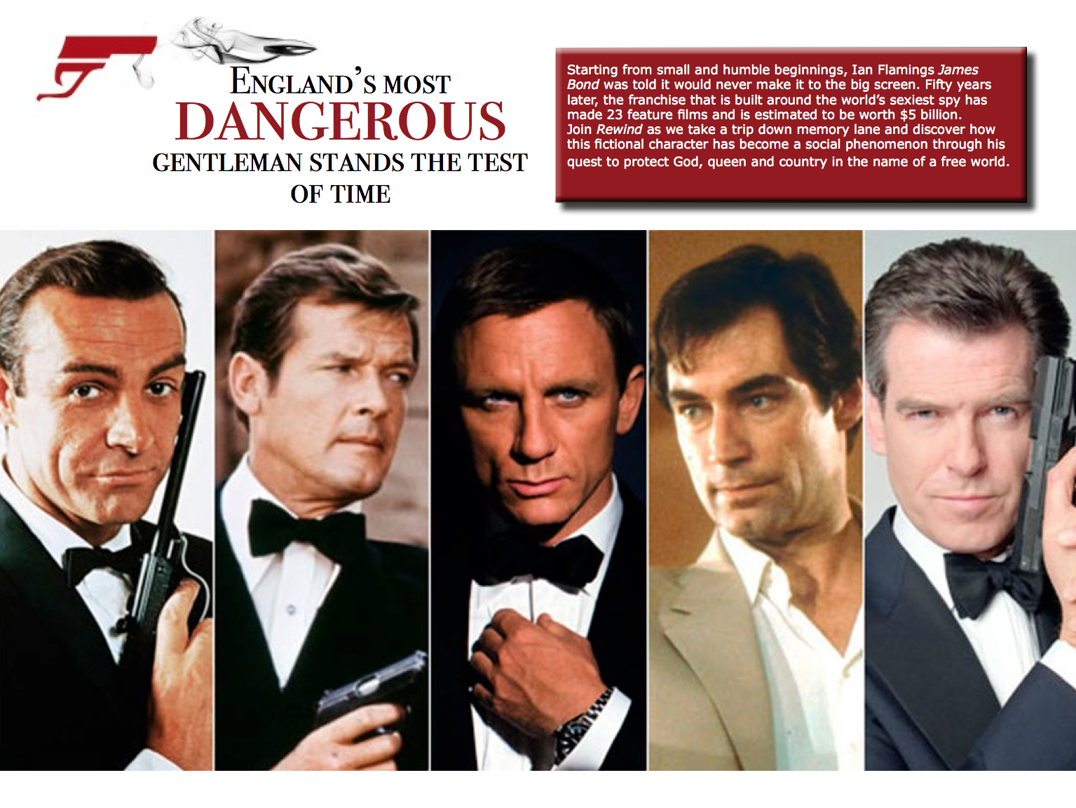
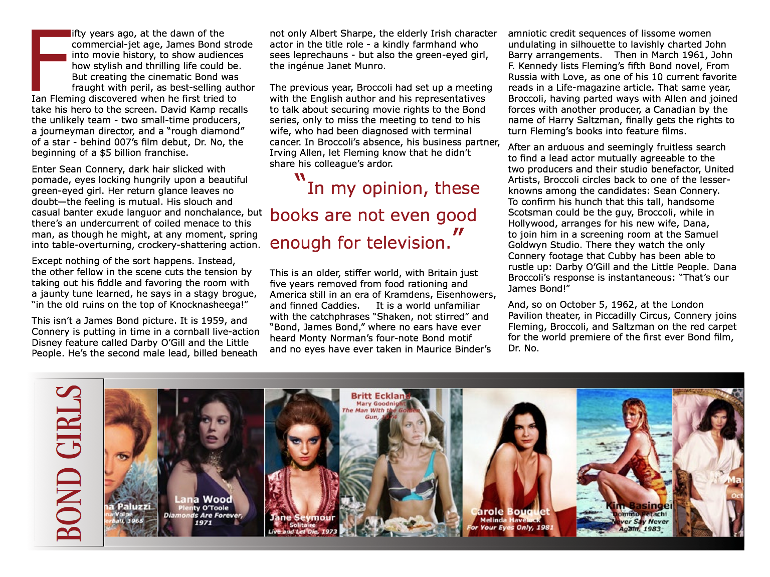
iPad Design
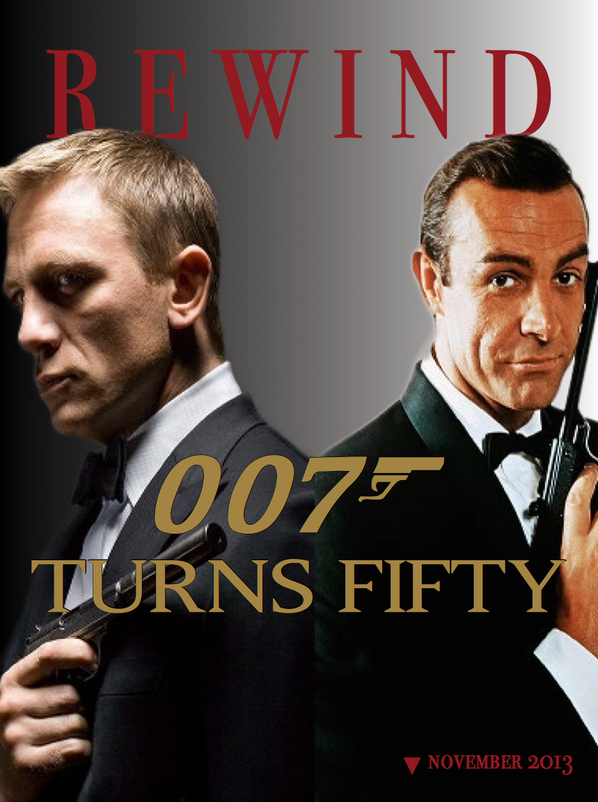
Headlines and Decks
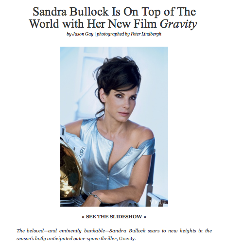
This feature story uses the phrase “on top of the world” as a metaphor for Sandra Bullocks latest notable accomplishment. This use of clever wording in the headline allows the reader to understand what the story is going to be about and lures them with the knowledge that Bullocks new movie “Gravity” is a huge hit.
In the case that a reader perusing through the pages of Vogue is not aware of Bullocks latest theatrical film, the deck goes on to explain what the story is specifically, filling in the gaps of an unanswered questions.
Both the headline and the deck do a really great job of tying Bullocks feature film “gravity” with the story with clever wording including “on top of the world”, “new heights” and “outer-space thriller”. The combination of this language with the picture below work to create a very enticing and effective headline. This is furthermore reinforced with the fact that Bullock is wearing what appears to be some sort of high fashion space suite with her arm resting on a gold space helmet. The sum of the individual parts of this feature story are hugely impacting and work to draw the reader in for more.
Magazine Layout
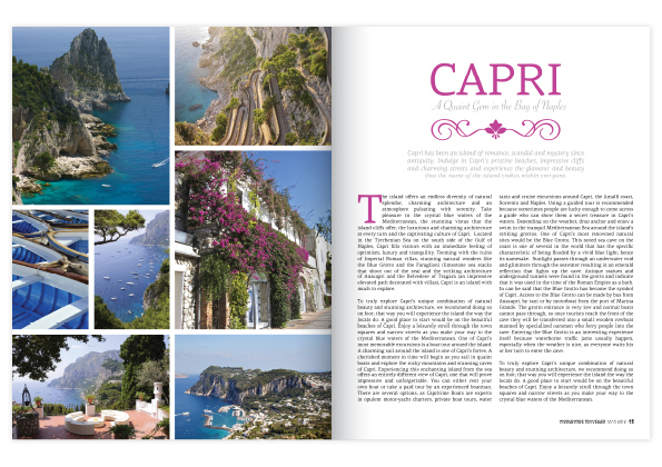
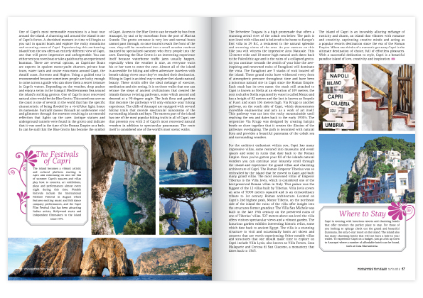
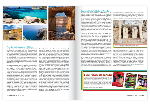 I LOVE everything travel and this is the quintessential magazine spread that makes you want to pack your bags, hope on a plane and lose yourself in explorative bliss. These two spreads are reasonably simple in their style with a lot of white space, uniformed typefaces and fantastic use of color. Looking at the gestalt theory #6, which says that everything contributes the greater whole, I can really see how each individual component plays its own part to make a really striking end products. Color has been used really effectively in this piece with the designer pulling out the most attractive and vivid shade of each photo and using it in the typefaces of the headings. Photos have been placed in a grid like form with the exception of the third page where it is on an angle, giving the page a very aesthetically pleasing look. Overall I think it is a very appealing and effective spread.
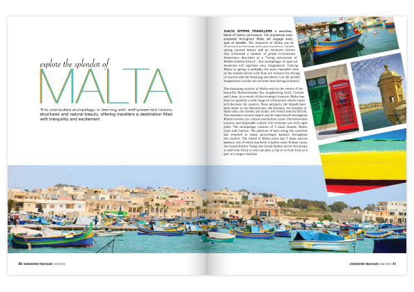
Capri and Malta anyone?
WWF
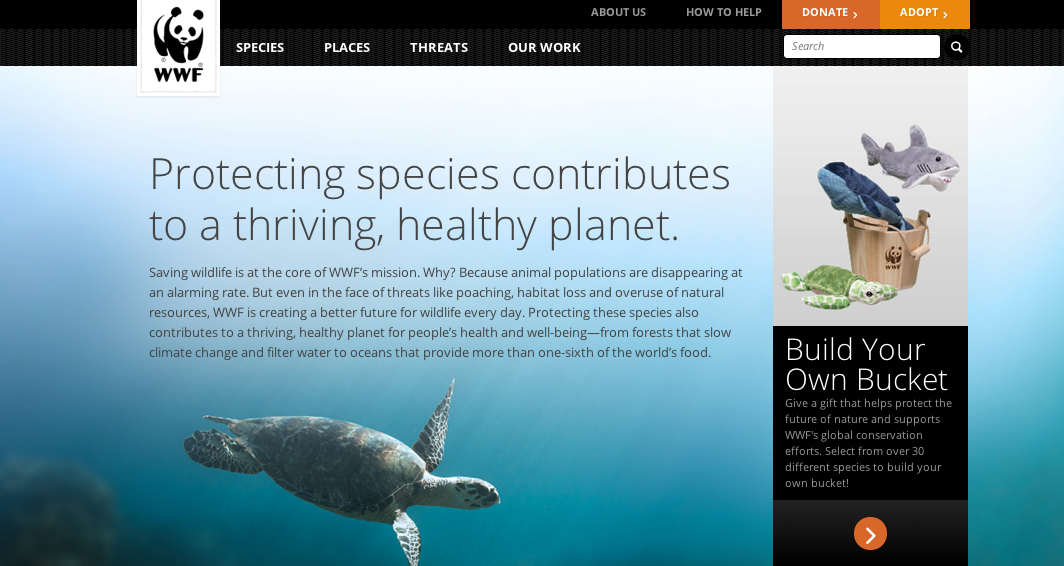 The World Wildlife Foundation employs the use of exquisite photography in an animals most intimate setting. This is essential to the success of the organization as it must appeal to its followers and subsequent donators that the very objects this website advertisers are worth saving. These photos are always of incredibly high quality and attempt to capture the detail and beauty of the environment in which the animal is set. Whether that be by using a wide angled lense to capture the greater area of a habitat (like shown with the turtle above) or zoomed in amazingly close, this website always parades its photos in an incredible way. The above picture really plays with light well as you can see the rays from the sun flooding in on the turtle from above and leading the viewers eye to this tranquil animal, imploring for the viewer to help it in its time of need. The blueness of the water is very calming and easy for the viewer to look at. This is often how the WWF displays its pictures as it evokes the most appropriate response from viewers.
Website – Gestalt Design “Uggs”
No website needs to be more visually appealing and attractive than a website trying to sell an object/item to its viewers.Websites that are the home base for selling clothes and shoes need to be universally simple to use while portraying their products as expertly as possible.
The Australian shoe/boot/slipper manufacturer Ugg’s has progessviely become more and more popular on an international scale. Products are shipped worldwide so the website that advertises its goods may send the viewer a message of quality and luxury – two characteristics that this company is known for.
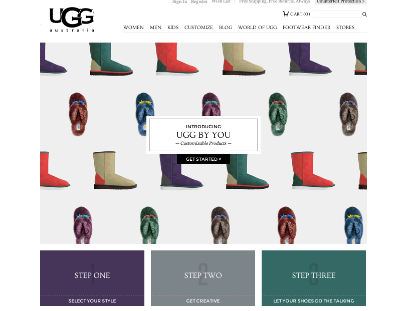
Figure and ground: The Ugg website does a great job of using white space. Products are used in appealing photography, however, when shopping for an individual piece, it stands alone. The foreground is not interrupted by a busy background. It is clean, simply and visually appealing.
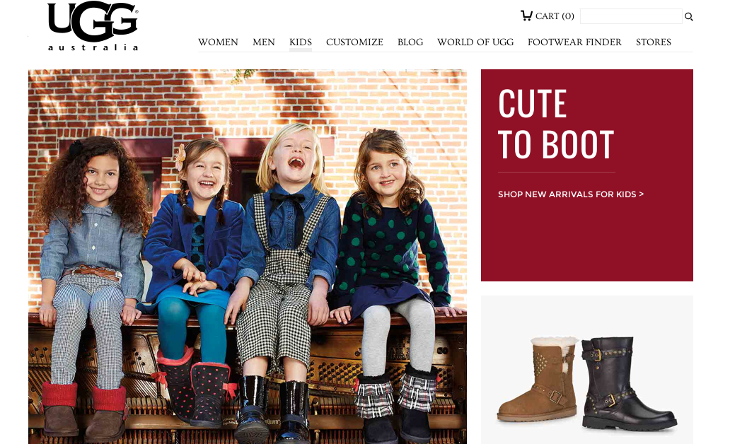 Proximity and alignment: The website does a great job on continuity throughout its pages. All typefaces are the same apart from the companies iconic logo which stands tall and strong on the top left hand corner of every page. Colors are explosive and appealing, but they all stay within the ‘prime colors’ zone and mix very well. Colors are also in their block for, they are not patterned or textured, just simply and uniformed.
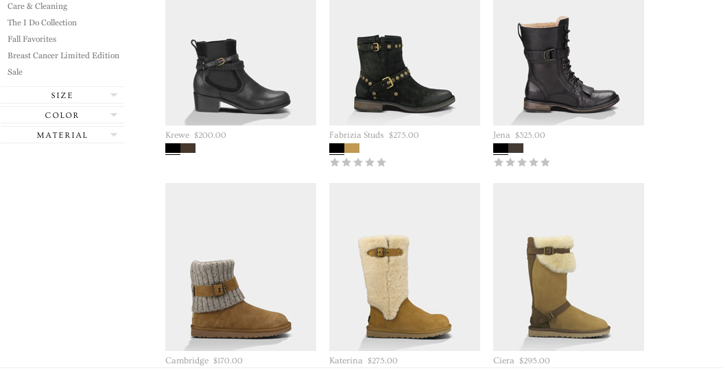 Lastly, visual heirachy is used in the display pictures that are feature points. There is quality photography throughout the site which features some of Uggs most popular products. The actual items for sale are separated by neat and easy to navigate boxs. Overall it is a great website.
GoPro Website
I love the GoPro website for its visual design. Go Pro is a universally renowned sporting and extreme activity camera. It takes incredible photos and videos the most dangerous and intense activities in the world while in some of the most extreme surroundings.
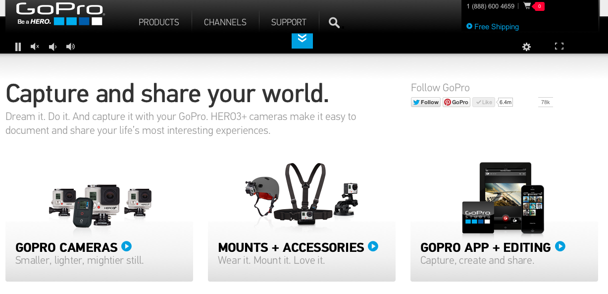
With all this in mind the web designers knew that they had to make a website as appealing as the product. This website is absolutely filled with photos and videos on every page. Instead of reading all the things you can do with the Go Pro, they show you with a video example.
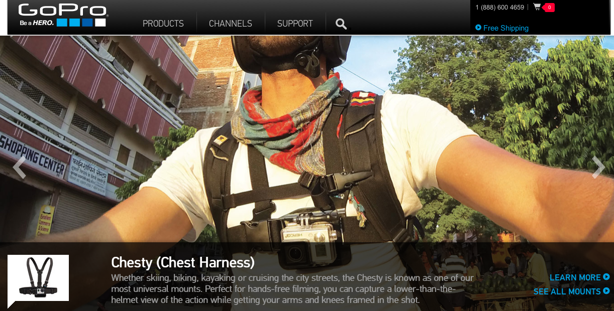
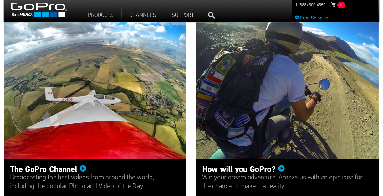
All the products have been expertly photographed and are on a very visual display. Text is at a minimum and is very simple and readable whenever it is used. Social media is everywhere and the chance to win some of this companies amazing products is always shown.
This website will make anyone, myself included want to buy a GoPro!
Marley’s World
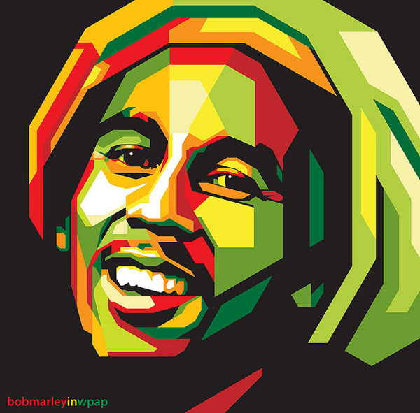
This illustration of Bob Marley is made with a black background then layers and layers of colored geometrical shapes placed on top of each other. The layers are necessary to get the overlap of shapes and to create the angles that emphasize the details of Marley’s face. The only circular area of this illustration are Marley’s eyes, but aside from this, this entire picture could have been created using both the pen and shape tools. By using white in the middle of Marley’s face, the artist has created the illusion of light shining from the aside which makes the entire piece look more three dimensional despite the hard angles and modern design. What I like most about this piece is the way the artist used all different shades of green, yellow, red and orange which is very indicative of Bob Marley and the way he has always been publicly portrayed. Even with the harsh sides and angles of the shapes emotion and personality still shines through Marley’s eyes and face in general which I think is well done considering the design of the illustration.
Avatar
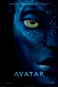
From the get go Avatar was intended to represent a heightened level of technology and a whole new viewing experience. Set in an alternate universe where a race of part human, part alien species have physical, emotional and spiritual powers far advanced to humans, James Cameron knew that the advertising for this film was going to have to represent something spectacular and mysteriously unearthly.
With that in mind, here was one of the posters used in the Avatar campaign. Simply picturing one of the Pandora natives, this picture doesn’t need anything more than this one mystical face to capture a viewers attention. With blue skin, terrifically bright green eyes and intriguing dollops of light tracing their way across this Na’vi’s face, the image looks very real and foreboding. What really captured me here was the way the Na’vi’s (I think this is Zoe Saldana’s Avatar, Neytiri) face leaps of the page as if it is 3D rather than an ordinary 2D image. The importance of making this image pop was huge to stay in keeping with the kind of viewing technology this film represented.
The use of black in the background makes the face even bolder and unearthly and light is used in a very unusual way. Rather than introducing any natural light into the image, the artist has made the Avatar’s skin glow which further separates this face from a human species. And the extremely large and bright eyes of the Avatar make this species seem as if it knows something you don’t, staring boldly off the page.
Overall I believe the artist did a terrific job of creating an image that would have lasting results and would encourage its viewers to seek out further what this movie was all about. With limited wording, the information is simple. “From the director of Titanic” is a smart move that instantly wins over a whole audience that have seen and loved Cameron’s Titanic for the historic masterpiece that it is. This one sentence ensures the viewer that the advertised movie will not disappoint – or at least that there is something new and special to be seen.
Lets see what Mr James Cameron will come up with next…