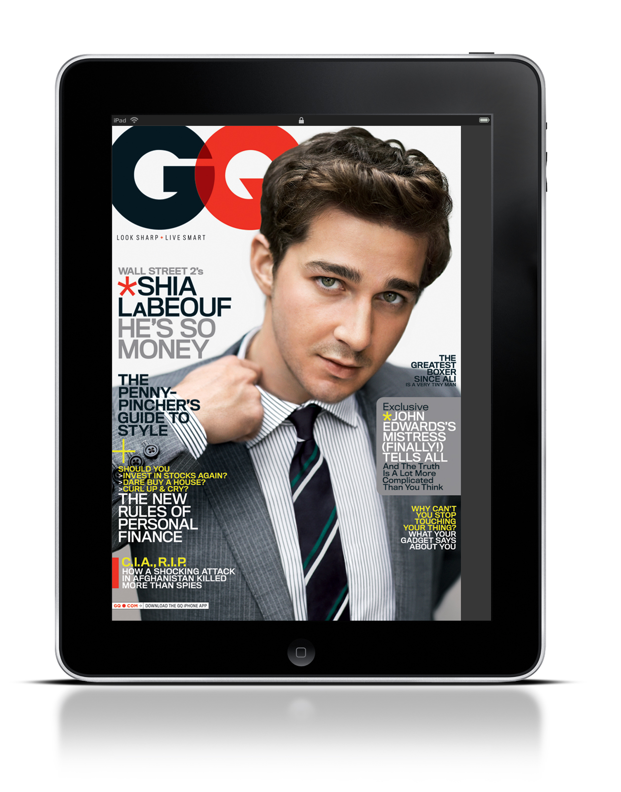
GQ’s iPad magazine differs very little from their print format. They use Gotham font on all of their covers.
2 thoughts on “GQ iPad Cover”
You’re right – GQ’s iPad cover is just as cluttered with headlines as the magazine. GQ always does a great job at choosing stand out colors, and keeping their photos simple and striking, a perfect way to capture the essence of the personality of whoever is on the cover.
I think it is interesting how GQ still decides to include multiple headlines on its iPad version rather than trying to keep it simple. They employ a triadic color scheme in the type, using red, blue and yellow.