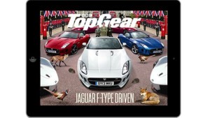
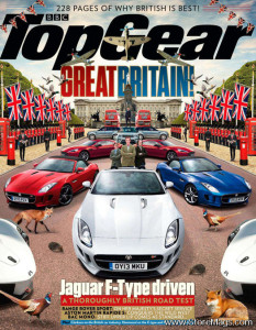
Top Gear is a magazine based on the BBC television show directed towards car enthusiasts. The title design/typography comes from the show. This issue highlights Britain, so they pulled the colors of the cars from the British flag. In the iPad format, there is mush less type and the photograph is significantly cropped. They also changed the color of “Top Gear” from black to white in the iPad version so it would not have an overwhelming presence.
GRA 217 Section 5 Group 2
The official blog for GRA 217 with Sherri Taylor


it would’ve been nice if the cover included a little more of the dek. and i feel like its a drastic change in the difference between the original title to the one on the iPad.