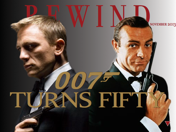
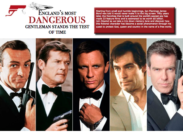
I really like this layout. The red and gold represent the Bond brand and you use this color in a consistent way throughout the layout. I also like how you used photos to help drive your layout.

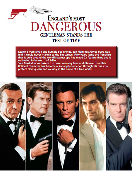

I really like this layout. The red and gold represent the Bond brand and you use this color in a consistent way throughout the layout. I also like how you used photos to help drive your layout.