I really like your emphasis on certain words in headlines, a result of the distinct typefaces. The photo selection is also strong- not to mention diverse. The macro photo on your opening does a great job at framing the head and dek text. If I were to have one suggestion it would be to make one of your photos on your jump more dominant. They are fighting each other for space, so I’d move it into three columns instead of two.
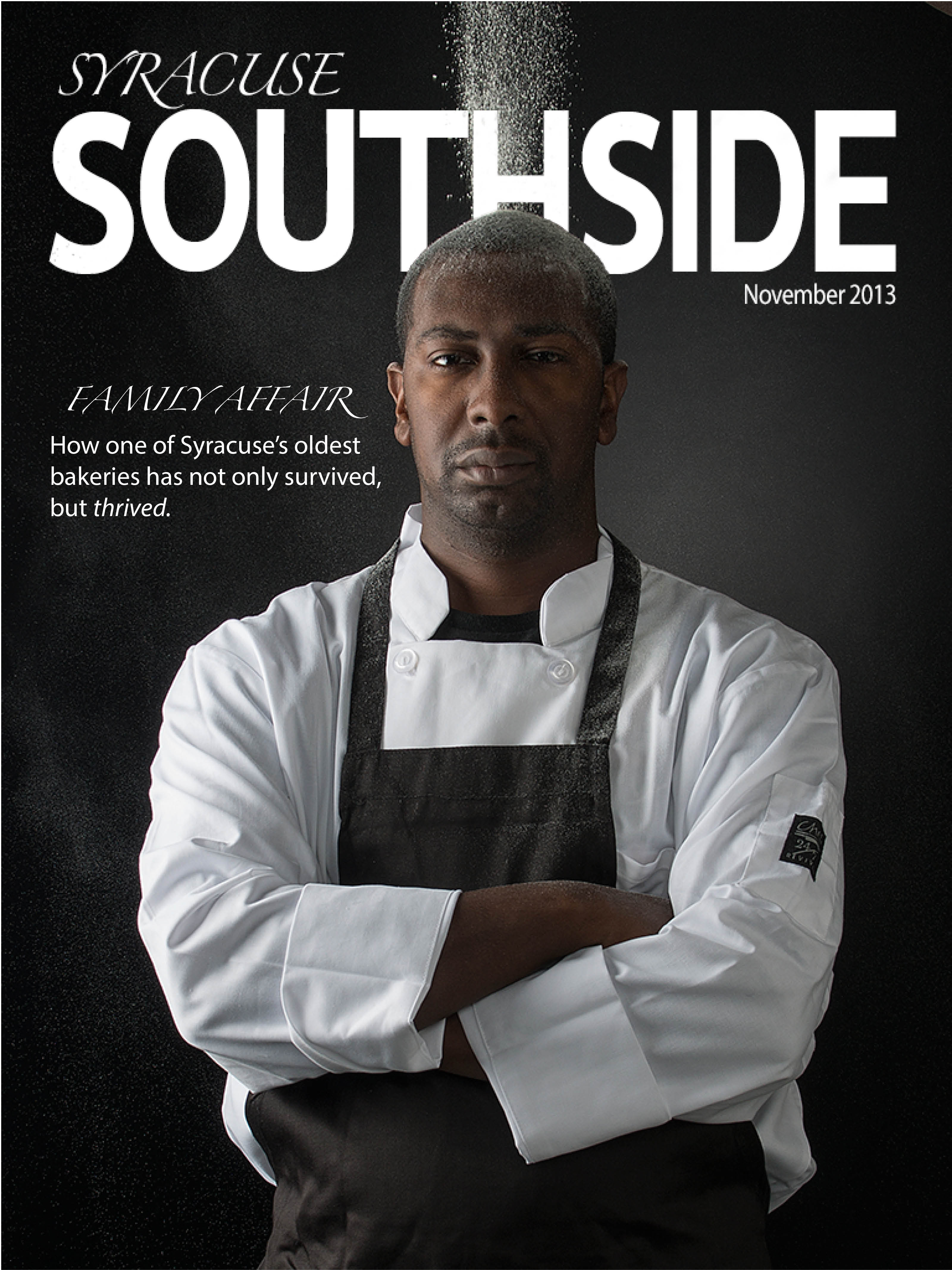
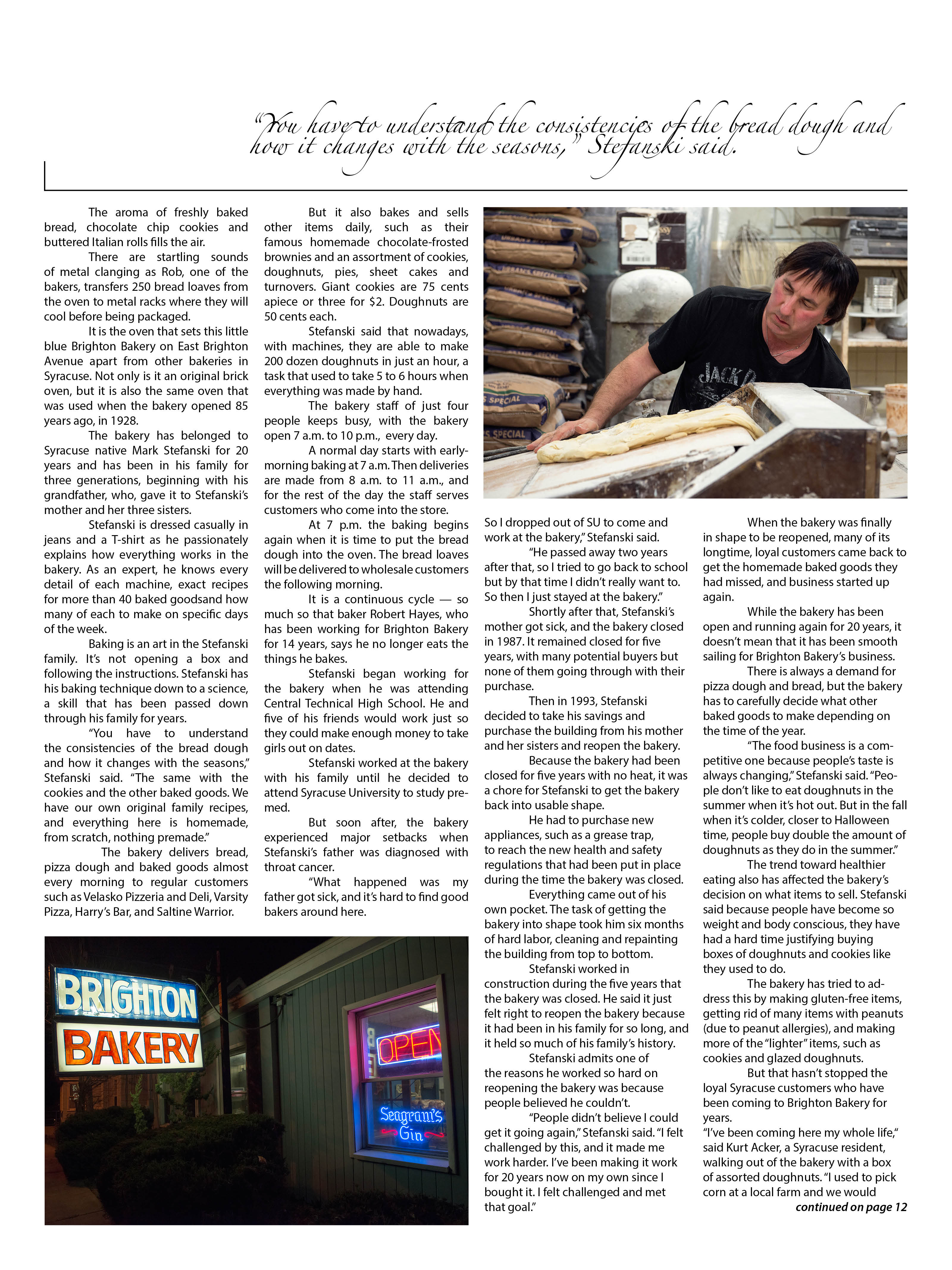
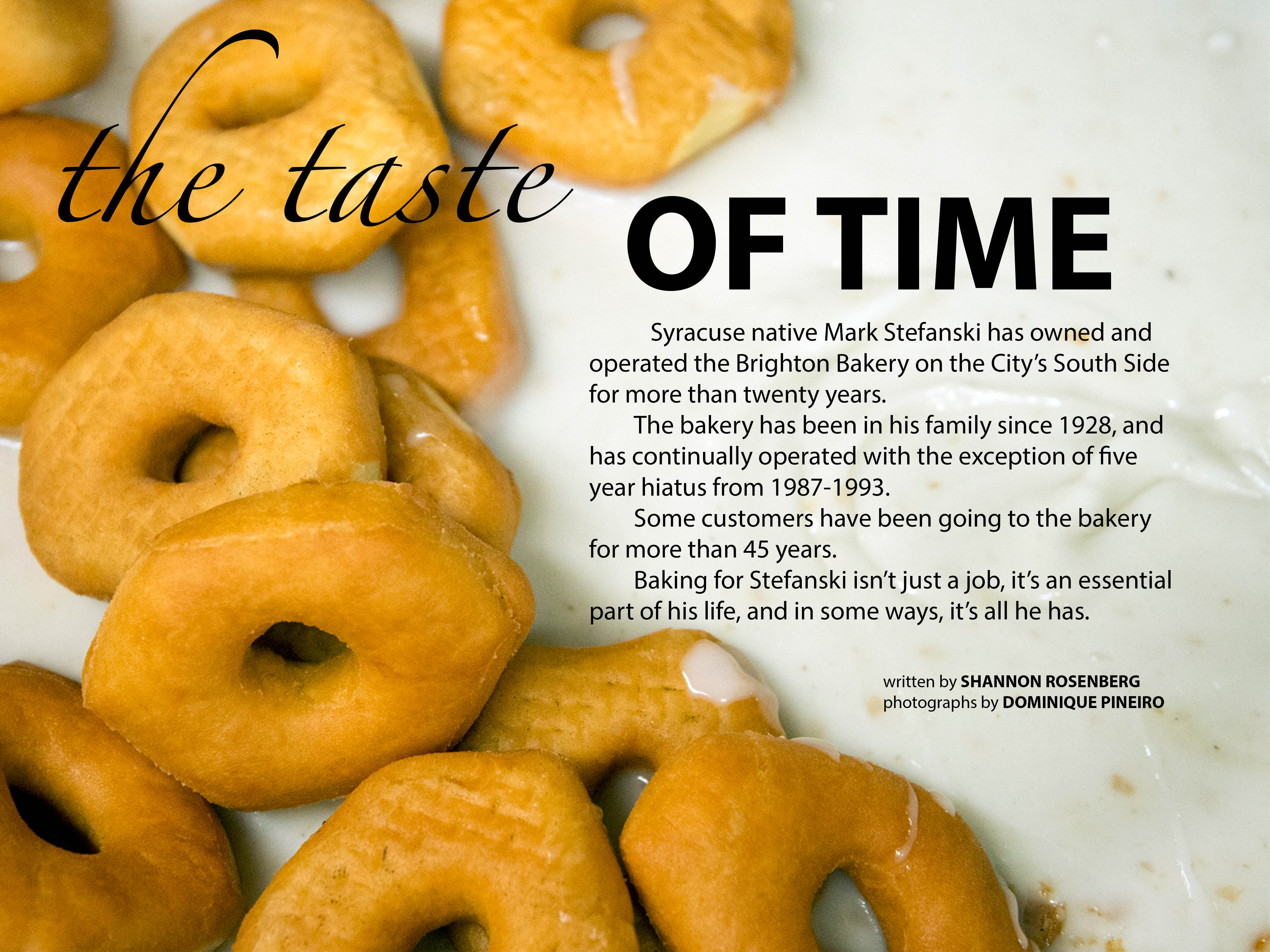
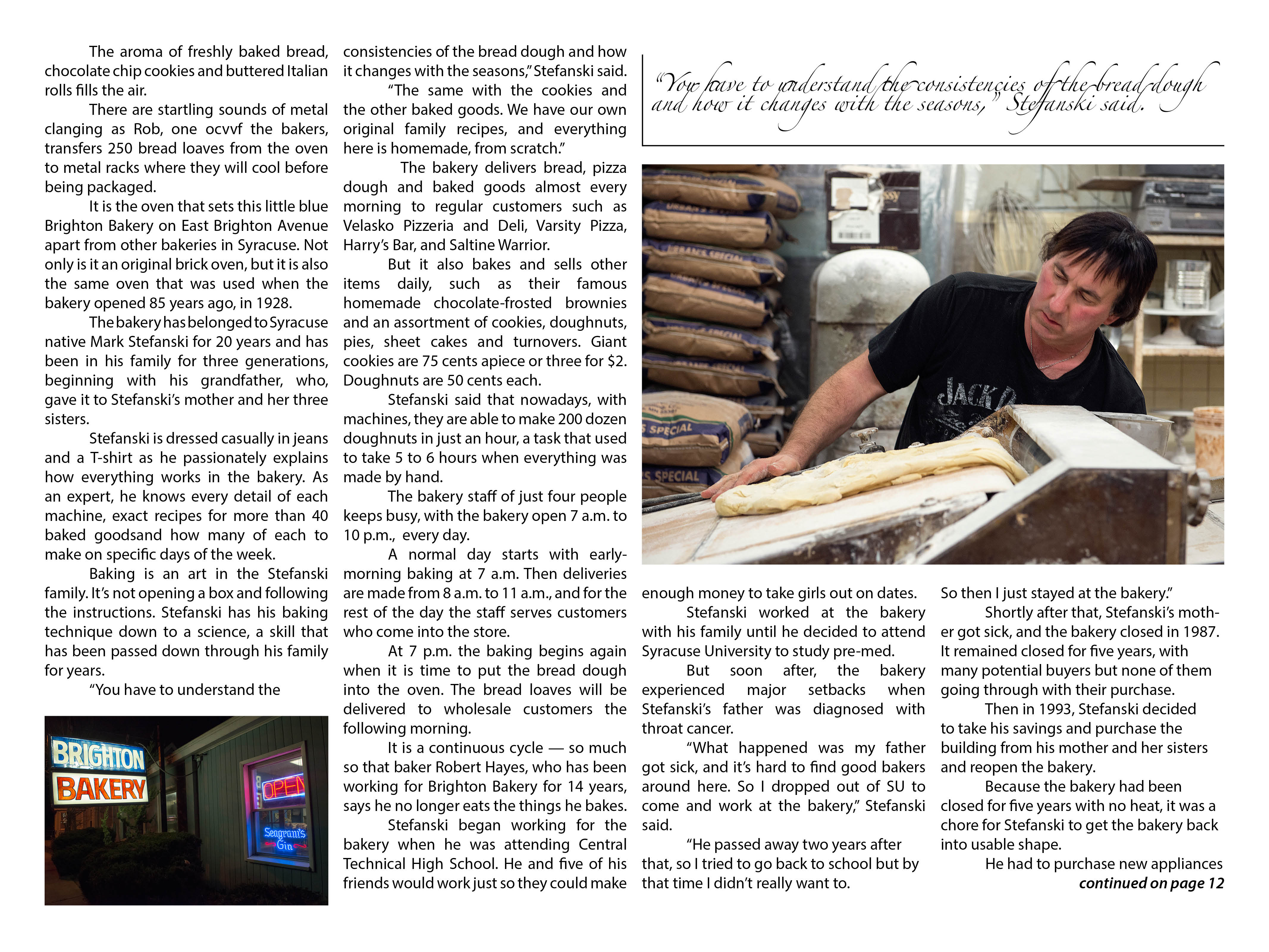

I really like your emphasis on certain words in headlines, a result of the distinct typefaces. The photo selection is also strong- not to mention diverse. The macro photo on your opening does a great job at framing the head and dek text. If I were to have one suggestion it would be to make one of your photos on your jump more dominant. They are fighting each other for space, so I’d move it into three columns instead of two.