I learned a lot while creating this project, especially how to create interactivity. So cool! I now really appreciate all that magazines do to draw in an audience. There is a lot of work that must go into the story, the photography, and the design process… and then they must convert it to work in different formats. So much work!
GRA 217 Section 5 Group 2
The official blog for GRA 217 with Sherri Taylor

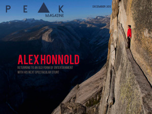
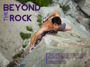
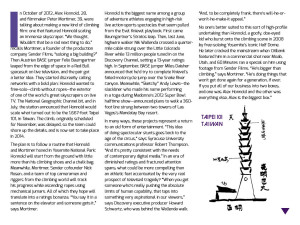
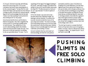
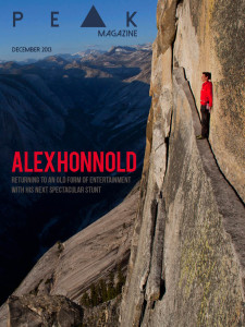
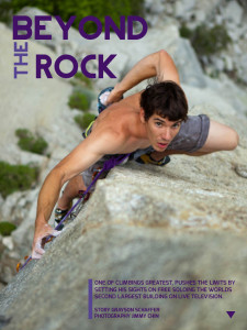
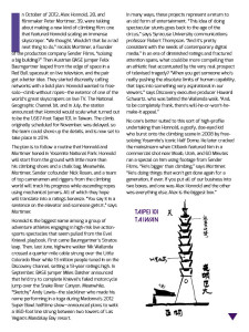
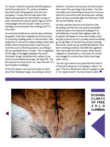
Bridget, these designs are so cool. The photos you used a perfect for the headlines, and they are very professional images in general. I also like how you kept the background simple, purple and white; it makes those pages look very clean. My favorite page is the cover page because the person’s red jacket matches the red type.