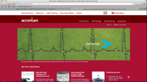
I am very biased in this post, as my parents work here, but whatever. I like Accenture’s website design primarily because of the scrolling visuals that are always present on their homepage – with the clients that they represent and their logo, the accent mark (ahem, hence ACCENTure), moving forward, etc. The links to different aspects of the website are clearly defined, and contrast with the colors of the backgrounds they are on. Red is a warm color, thus standing out to whoever is viewing the page. Also, at the bottom of the screen, there are short snippets of information as the “latest news” section of the homepage. Not included is the very bottom of the website, which includes social media such as Facebook, LinkedIn, Twitter, YouTube, Google+, an RSS feed, podcasts, blogs, and much more. It’s a very clean design, emphasizing the modern and advanced nature of the services one could get by working with Accenture.
GRA 217 Section 5 Group 2
The official blog for GRA 217 with Sherri Taylor


Courtney, I agree with you. Even though my parents don’t work for Accenture, I still like this website design. The green pops out against the red. Although we can’t see it in the screenshot, I think it is super important that this website includes all the different links to the different types of social media. Similar to what you said, the simplicity of this website keeps it modern and up-to-date. Most importantly, it is a good example of the work that Accenture is capable of producing for its clients.
Like Dena, neither of my parents work for Accenture, yet I still find the web design appealing. I like the large margins on the sides because it makes the page seem clean and organized. As we have been taught, “White space is good space.” In this case, I think red space is good space. I also like the layout of one big picture to capture the attention of viewers, and then three smaller pictures that have links to different pages. It is an organized yet visually interesting layout.