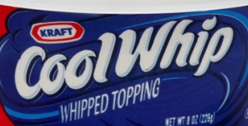
The typeface Cool Whip uses, which resembles Gans Antigua Gold, is a fun and effective wordmark. The letters look like the the topping when it is scooped out of the container. The color white also represents the contents inside the package, which is excellent brand identity. The characteristics of the word mark such as the typeface, color and arc gives an air of lightness and fun. It creates a memorable visual due to the quirkiness of the serifs and the tight kerning of the letters. The brand identity is also incredibly strong because when you look at the wordmark you are immediately reminded of the contents within the package and how tasty it is to eat.
GRA 217 Section 5 Group 2
The official blog for GRA 217 with Sherri Taylor

Hey Peggy. I certainly agree with you regarding the typeface looking like the contents of the container: delicious whipped cream. This adds a flavor to the wordmark that speaks directly about the tasteful brand identity. The part of the wordmark though that I think isn’t as strong is the typeface that says “Whipped Topping”. The W and H of “Whipped” look smushed almost, and they blend to much with the streak that runs into “Whipped Topping”. If the typeface of this was much stretched out, I feel that it would add more to the wordmark overall.