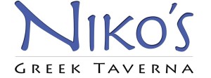
This typeface, most closely related to Aeris Pro A Bold, is very well-suited for Niko’s Greek Taverna. Being a Greek restaurant, this typeface adds a very “Greeky” feel to the wordmark, and therefore, gives the restaurant more culture that is crucial for its success in the restaurant business. Due to size and color, “Niko’s” is the main focus of the wordmark, which brings out the significance of that particular name to the restaurant. The type surely aligns with the brand identity design because the wordmark accurately portrays the feel of the restaurant.
GRA 217 Section 5 Group 2
The official blog for GRA 217 with Sherri Taylor

