
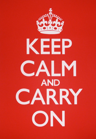
Originally, this poster was intended to increase British morale before the Second World War. Now, this poster has become even more famous. I see this poster almost everywhere, and I believe that it has a powerful message. It tells its’ viewer to not worry about what is going on, but to remain calm, and to keep moving along. Not only is its’ message very strong, but it is designed very well. The Gill Sans typography that is used remains the same throughout the entire poster. It is white, bold, and stands out very clearly in front of the bright, red background. The typography, color, and design are very clear and keep the message short and simple. I don’t believe anything should be changed to this poster to improve its effectiveness.
I agree that this poster really stand out. The red really captures the attention and the white letters provide a contrast that makes the words easy to read. I do wonder why the designer picked red to be the color for the background? Red is not considered a very calming color. Maybe the designer chose red because the British were well-known as the Redcoats? Maybe because red is in the British flag? It is an interesting choice, but I think it works because the poster does a great job of catching the reader’s eye.
I agree with all of your comments about this poster. I have always been a fan of these posters because of their simplicity and easy, yet playful conveying of the messages. They are so easy to read and concise, and I like that the posters are always two tones; I have one in my room and it is pink with white letters, so it seems all the font colors remain the same for the posters. The only thing that I question is the reason the word “and” is so small.