
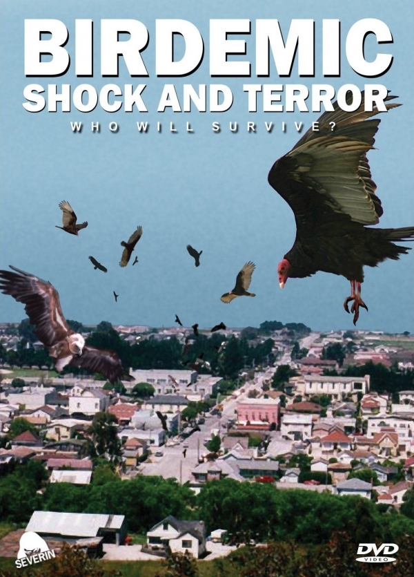
Everything about this poster conveys the look and feel of a “Birdemic”. The designer’s use of “Ariel Bold” for the title creates a sense of impact, and helps reinforce the film’s serious tone. One of the things I really like about this poster is how the designer created a “three dimensional space.” You’re not seeing just one element, but you’re seeing many elements and it helps tell the overall story. The way the birds are closing in on an unsuspecting sleepy town really creates a feeling of claustrophobia and terror.
When I think of the word “Birdemic” a few things come to mind: many birds, impact and chaos. First off, there are obviously a lot of birds in the poster (10 to be exact). Second, the font of the title helps convey impact. The arial bold makes the words appear bigger and wider. This makes it so the words take up much of the width of the poster. Additionally, the fact the lines are so close together helps stress the feeling of impact. Lastly, the words below the title and the positioning of the birds helps evoke chaos in the title. The words “shock” and “terror” definitely conveys chaos. It makes me feeling worried, scared yet confused all at the same time. Also, since the birds are flying all around at all different depths, I have those same feelings. Worried that the birds are harming the town, scared that the birds are hurting the area and confused as to why the birds are threatening. I almost feel like me, a viewer of the poster, am in danger of being attacked by a diseased bird.