
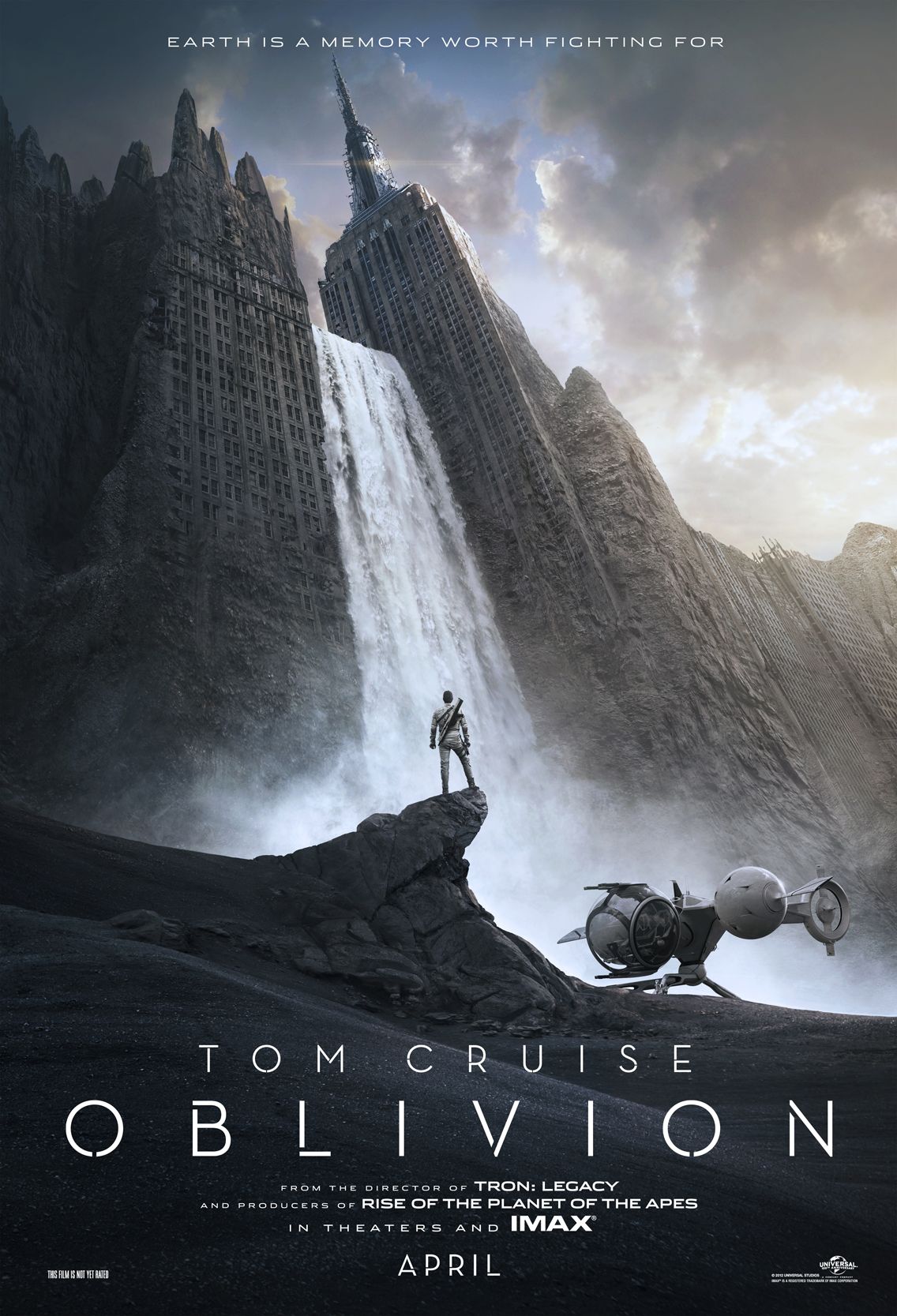
I think the poster of Oblivion, a 2013 American movie based on a post-apocalyptic science fiction, is very shocking and attractive. We can clearly see the eroded Empire State Building and the adjacent buildings occupy most of space of the poster. And the white and huge fall, which cascades down between the buildings, overwhelmingly draw our eyeballs. As one reason makes the scene so impressive, the angle of the shot is from the ground to the building’s top, making us feel small and dread. The second reason is that the Empire State Building in Manhattan is very familiar to most of us, so it make us feel shock to imagine such a scene. In addition, the male figure and the “aircraft” not only show the huge comparison between the small figures to the grand and imposing buildings, but also reveal that they are not at the present time, but in the future. The words may be sans serif geometric typeface with a specially spilt design. These thin and white words give us a strong post-apocalyptic feeling, which are very appropriate to the background of this movie. Honestly, I watched this movie right after it screened because I was attracted by this poster. Although the movie was not as good as I imagined, its poster did gain its marketing goal and drew a great amount of people’s attention.
I really like this poster. I love how tiny the man looks because of how tall the buildings look. Awesome.
I really like the scope of this poster and like Sergio said above, how well it illustrates the size and the magnitude of the situation. I think the artist has done a great job with the use of light and color, emphasizing the darkness at the bottom of the page and the light and small amount of blue sky at the top of the page. The darkness at the bottom implies and very dull and dreary situation – while I have not seen this movie and don’t know what it is about, it makes me feel like there has been some kind of disaster or invasion and only structures like the Empire State Building have survived.
As far as the typeface goes, I think this kind of font looks very bold and modern which effectively ties in with the very technically advanced looking spaceship beside Mr Cruise.
I really like this poster too. The contrasting colors really make it work with the extreme scaling going happening in the picture. I think you’re right when you bring up using an iconic building in an iconic city. I also appreciate you assessment of the typography, but I think the type would pop better if it was a thicker stroke. It probably looks better in full size though.