
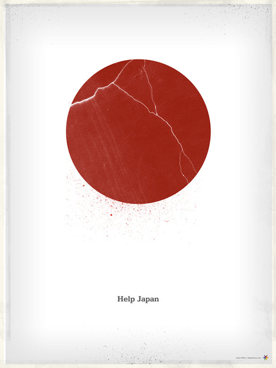
I really like this poster because it shows how well subtly can work when it’s executed well. The red circle in the symbol for the ‘rising sun’ on the Japanese flag and cracks represent the 2011 earthquake and tsunami. The typography is small and simple, but the message is clear and concise.The white space really adds to the simple effect and bold red color of the rising sun draws your eye in from a distance. I also like the dusty edges of the frame that break the white space evenly, but still everything is very subtle. The type, although small, pops because of it’s isolation on the page. I think the mix of powerful symbolism here and the simple message make the audience draw a conclusion very quickly about what the message the poster is trying to convey.
help japan poster
I find it funny how I was going to post the same exact poster, but you beat me to it Antonio. The simple yet powerful design with the crack in the circle is just amazing.
Wow. This is a powerful poster. It’s simplicity at its finest.
I really like this poster especially because it uses very minimum visual yet conveys such powerful message. The crack on the red circle of the Japanese flag pretty much speaks for itself. I don’t even think it was to put the copy in the poster necessarily.