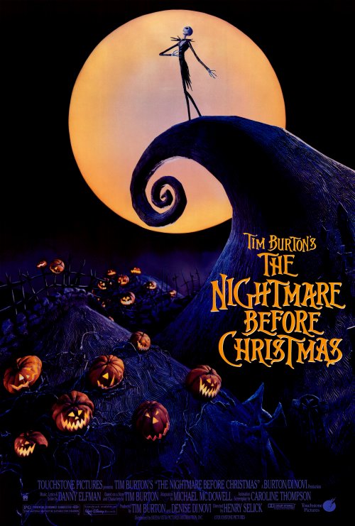
I think the Nightmare Before Christmas poster is exceptional because it embody the graphic style and essence that come to signify Tim Burton’s work using a simple and contrasting, but complimenting color pallet. Color is used sparingly to bring just enough detail from the black background to create the image. The ornate, whimsical and somewhat ornate typeface also sets an accurate expectation for the feel of the movie — fun but freakish.
GRA 217 Section 5 Group 2
The official blog for GRA 217 with Sherri Taylor

The bright moon against the black sky is very eye catching. It brings the eye immediately to the figure. Then by using another bright yellow color (similar to the moon’s) the eye goes to the title. So just by using color the designer draws the viewer to the most important parts… the subject and the title.
I noticed how the spiral hill also makes the eye travel from the center to the bottom of the poster. Also, the informational text is in the same color as the hill and fades behind the pumpkins and the title itself. It allows for the poster to have a cleaner, less text-heavy feel.