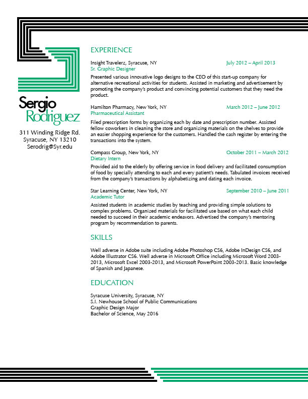
I really love the design elements in your resume. The lines are very creatively employed. I really like how you created the “S” above your wordmark… very clever. The type of green you used evokes a clean and almost refreshing feeling. Your resume is very stylistic and at the same time very professional. It is wicked!
I really really like your approach to this project. I agree with Bridget about the use of refreshing colors. Very nice. The only thing I would suggest as a helpful addition is a little more subtle text hierarchy in your body type, but that’s it. Very nicely done.