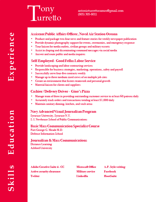
Tony, I like your word mark a lot. I love how the T applies to both your first and last name. I think there is way too much pink in this resume. The pink takes away from your text, and it looks unprofessional. Also, I would put periods in between the numbers of your cell number like this… 805.305.8011. Lastly, I would create more space in between your experience and education sections, and I would take away space in between your education and skills sections.
I can understand where Dena is coming from with the bright color, but personally, I think the red is a bold and daring choice for a resume and it will definitely make someone stop and want to ask you why, which is the point of a creative resume. I especially love the two blocks (one up the left side, one across the top) because it looks like half of a T, to emphasize your name. That was definitely smart on your part. The spacing could be redone on the Education section, but not the header, just center your body text. I think if the body text was black, it would definitely pop against that red background and be more effective than an all red resume.