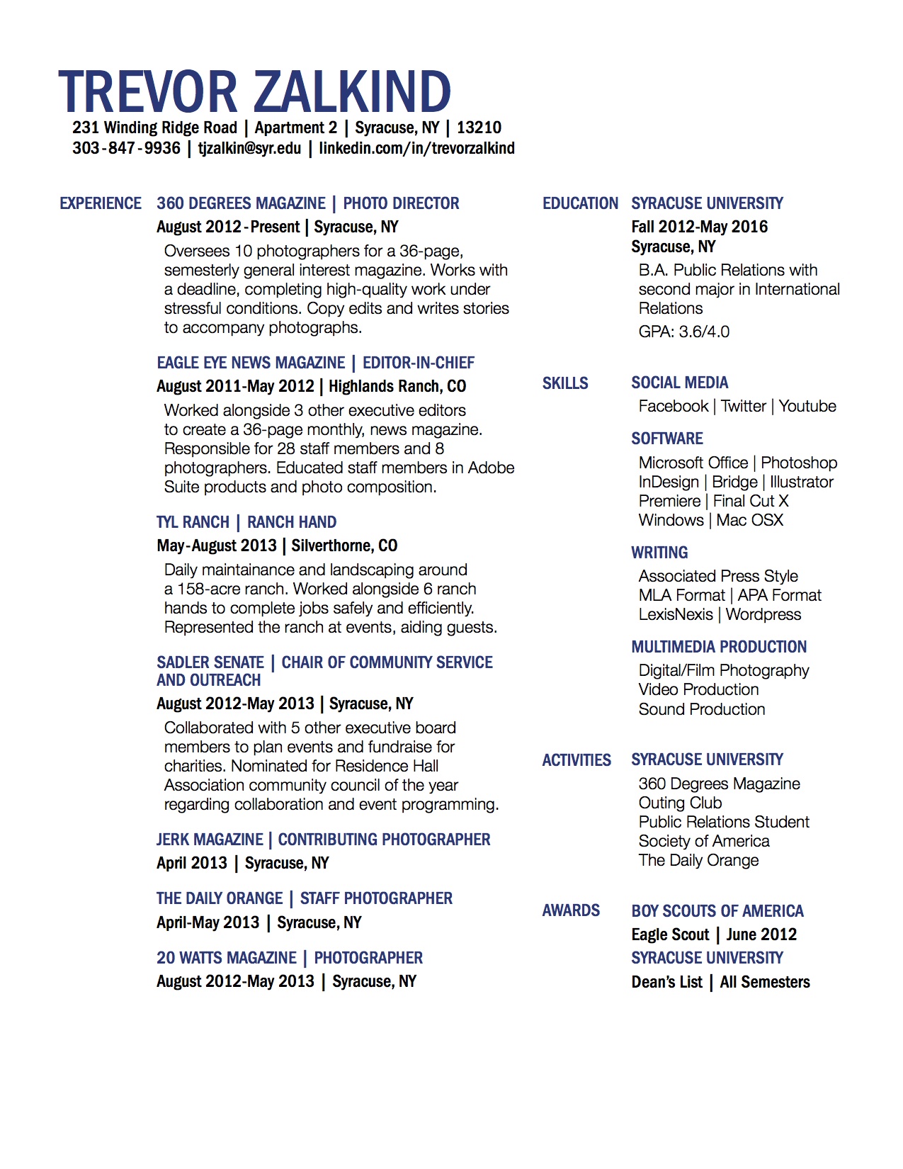
I like the use of the blue and black as your color scheme, it looks very professional. But, you have a lot of information in a small space. The way it’s laid out is hard to read and it’s difficult to quickly extract key information.
I like your resume because it is professional, organized, clear, and bold. I like your choice of color because it gives a sense of masculinity and sociable personality at the same time. If I were to suggest for an improvement, it would be changing the layout of the resume so that white space would more defined and separation between contents will be clearer.