
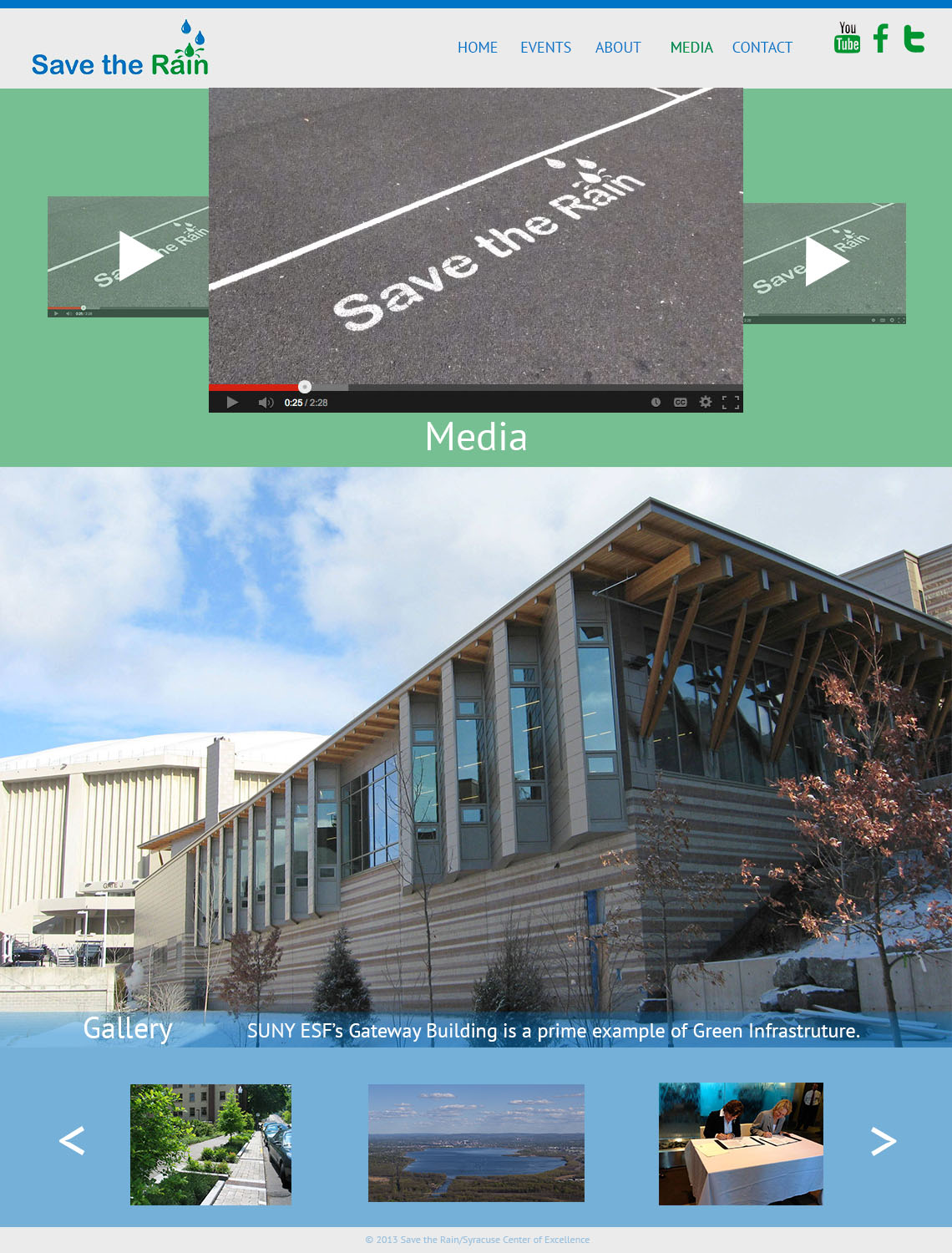
Having previously worked for a number of publications in the past, I had a meager knowledge of graphic design mainly with regards to the adobe programs we used. However, I had no idea how many principles of visual hierarchy and gestalt and color and type went into creating a single visual out of multiple components. This class enabled me to refine my already established skills into a more professional level… Though I still have a long way to go to be considered a professional.
Tag Archives: Zalkind
Forge Magazine Ipad Cover
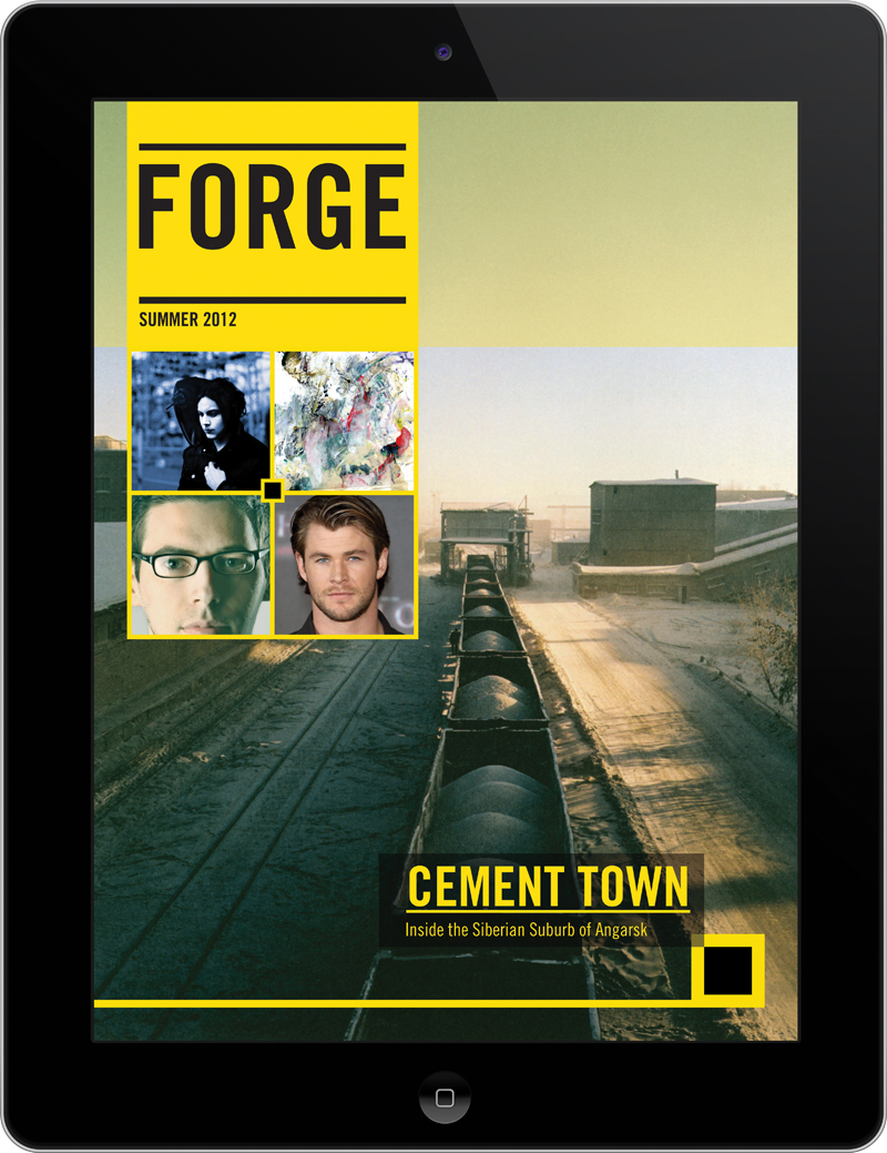 This cover differentiates itself from other Ipad covers by minimalizing text. Instead of having cover lines, there are photos that I presume can be tapped on to reach the story. Also, the cover makes use of only two primary colors. The combination of black and yellow allows for a sense of illumination, especially when used in text. The photo on the cover has a good amount of perspective, driven by the train cars that get smaller as one looks further back. Often times covers forget that having only a little bit of content on the cover can be good. Covers are often crowded and lack a sense of visual hierarchy.
Trevor Zalkind Web Design
Head and Dek – Foreign Policy Magazine
Head: Waiting in the Wings
Dek: As America’s star power dims, who will take center stage?
Article: http://www.foreignpolicy.com/articles/2013/11/06/waiting_in_the_wings_the_united_states_takes_supporting_role_on_global_stage
Magazine Spread
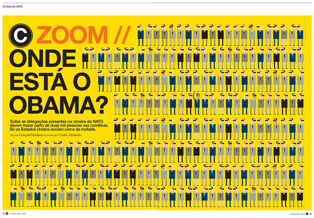 This Portuguese news magazine, i jornal, is consistently one of the most well designed news magazines in the world. Even their website can be placed among the top tiers in web design. However, at a more fundamental level, this individual spread stands out because of the simplicity, repetition, and the visual connecting with the words. Even if you can’t read Portuguese (I sure can’t) the article is about Obama and his place among other political leaders. This can be seen in the quirky-yet-simple portrayals of the individuals and the contrast of Obama’s arm raised. The yellow background also draws the eye in to see what the fuss is about.
Trevor Zalkind Logo
![]() For my logo (created haphazardly in Photoshop), I used my initials and the text creatively to form one object. My full name, Trevor John Zalkind, is represented. Through decreasing the type of the “J,” I deemphasized the initial, while maintaining a closeness between the “T” and the “Z.” I used ITC Franklin Gothic Bold Condensed for the typeface, which is a very masculine and defined typeface. The color, a dark blue, is also relatively masculine and contrasts greatly with the white background of the page. The only similarities with my initials was the bar at the meanline, so I made sure to make that the combining factor of the logo. Instead of being three separate letters, the logo now combines my three initials into a single entity.
For my logo (created haphazardly in Photoshop), I used my initials and the text creatively to form one object. My full name, Trevor John Zalkind, is represented. Through decreasing the type of the “J,” I deemphasized the initial, while maintaining a closeness between the “T” and the “Z.” I used ITC Franklin Gothic Bold Condensed for the typeface, which is a very masculine and defined typeface. The color, a dark blue, is also relatively masculine and contrasts greatly with the white background of the page. The only similarities with my initials was the bar at the meanline, so I made sure to make that the combining factor of the logo. Instead of being three separate letters, the logo now combines my three initials into a single entity.
Trevor Zalkind Resume 1B
Afgn
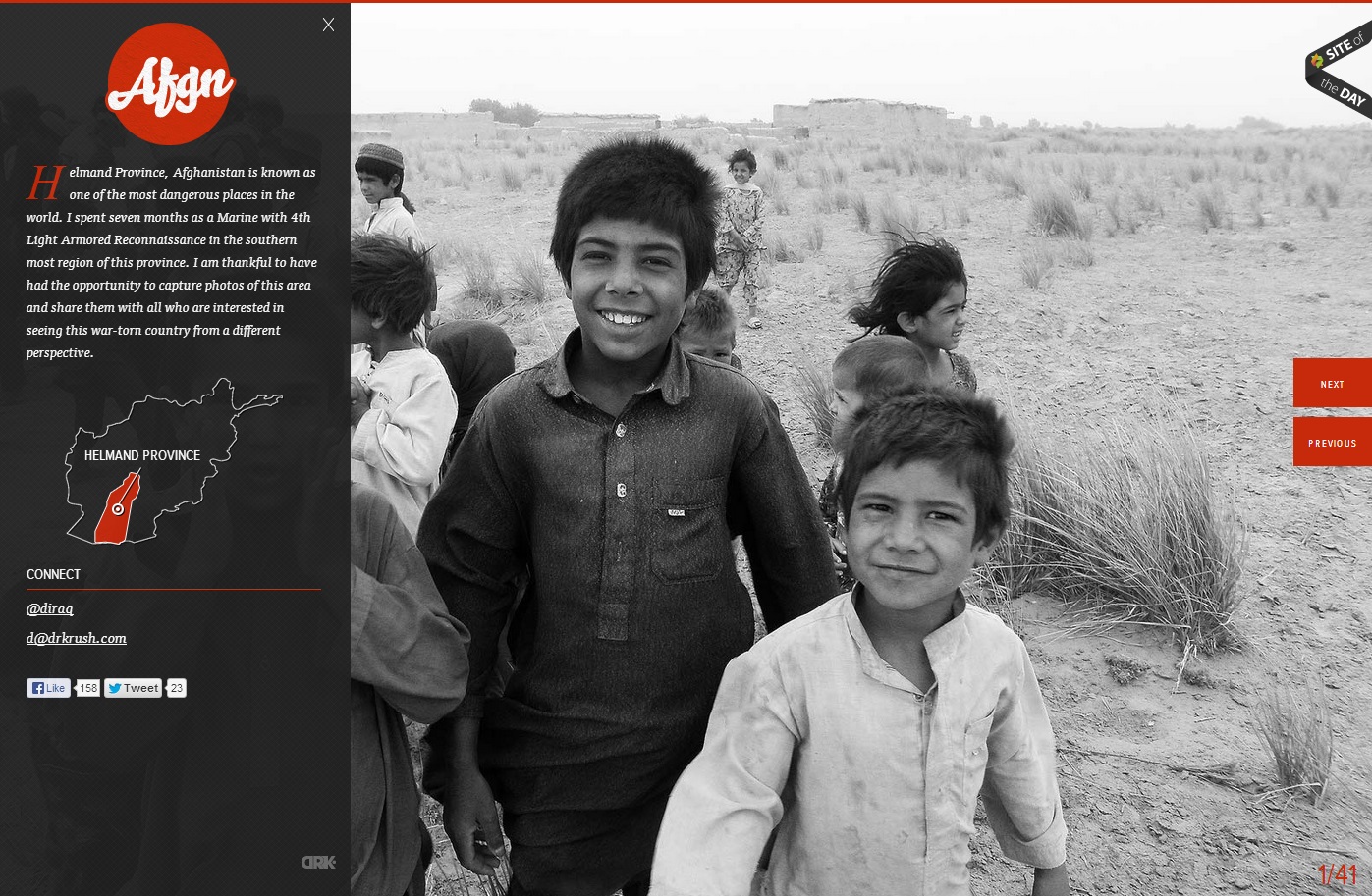
In this website, the photo of the children in grayscale provides a means of emphasis in the orange-red type and graphics. The heat of the color contrasted with the black and white of the photo creates key emphasis of the Afgn logo, the dropcap, the Helmand Province graphic, and the previous and next buttons. All of the emphasized aspects are vital to the webpage. However, they do not stand out from the picture, which creates a friendly face for the area and detracts from the Islamist extremist stereotypes of the region. The photo is covered up by the black transparency on the left, but the whiteness of the boy’s smile captures the initial attention in the site.
Studio MPLS Gestalt Principles
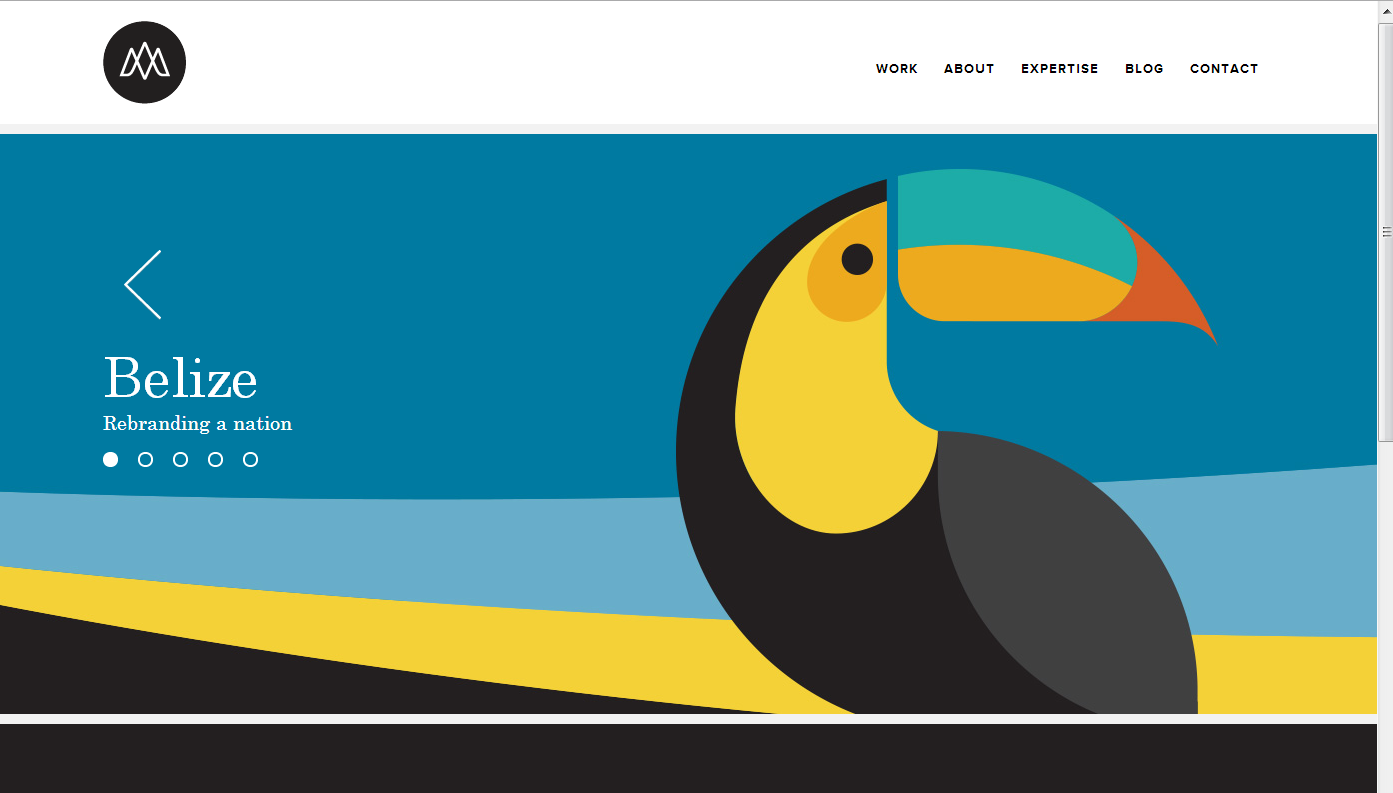
Many of my favorite websites are often simplistic. This website, studiompls.com is no different. A good website also follows gestalt principles. Here are a few examples of gestalt found in this example:
Similarity: This site has panels that change. The grouping of the multiple shapes into the form of the toucan creates a similar shape that distinguishes itself from the rest of the web page.
Closure: The toucan beak is not connected or closed off with the rest of the toucan, so the mind seeks closure and does so to assume the beak and body are one object.
Proximity: The formation of the section words in the top right are close together in proximity, allowing for the mind to group these concepts together.
Figure and Ground: The website easily differentiates the background with the figure because the background is white. Regardless, even with the toucan graphic, the toucan is easily distinguishable from the background because of the vertical vs horizontal contrast.