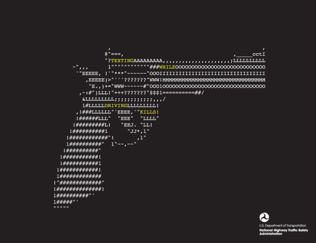
This design solely relies on typographic to create this image of a gun. The purpose of this graphic is for public service announcement, raising awareness for the danger of texting while driving. By creating a shape of a gun through face found in regular phone while texting, it allows viewers to create the realtionship between the gun (and its associated values such as violence) and texting in the car.
GRA 217 Section 5 Group 2
The official blog for GRA 217 with Sherri Taylor


I find it interesting that this PSA is about texting while driving. Of course I understand that guns are bad and I get that the typography stresses death, texting and driving, but what is the image of a gun really a good image to associated on with texting a driving? I feel like a broken phone or car would make a lot more sense.