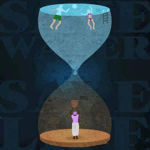
 This illustration effectively identifies the disparity in water distribution throughout the world in one clever image. Yet how is it so effective?
In Adobe Illustrator and illustrating in general, perspective is key. Through applying multiple shades of color throughout the image and placing the words behind the illustration, there exists a sort of depth that wouldn’t exist otherwise. It is also important to note the figures within the hour glass and even the hour glass are simplified. There is very little detail in the shapes, but the shapes are recognizable. Most if not all of the shapes involved in the illustration can be created through utilizing the pen tool. There are other tools such as the gradient tool that can also provide shadow or a sense of light progression which can be seen in the faint aura behind the drop of water.
The most effective illustrations are not complicated yet discuss an intricate, complex idea. A simple hourglass is transformed into a potent metaphor of the water crisis that the world is facing.

This illustration looks like it requires a lot of knowledge of the software to create it. I especially like the texture and the use of color to show the depth of the background. Also, the richness of color, and the use of complimentary colors (yellow sand and navy) is quiet impressive.
This is a great example of how concept is king. It’s a simple idea and relatively simple execution compared to other designs posted to the blog this week, but the concept conveys the message so well. I think this is an example where we can draw the line between a pretty design and a design that is actively sending a message.
The shapes presented in the design are relatively easy to make, but the color pattern is something that I’ve never seen before. The shapes can be made with a pen tool and colors applied with fills in different layers. Very nice design. My favorite for this week.