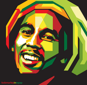
This illustration of Bob Marley is made with a black background then layers and layers of colored geometrical shapes placed on top of each other. The layers are necessary to get the overlap of shapes and to create the angles that emphasize the details of Marley’s face. The only circular area of this illustration are Marley’s eyes, but aside from this, this entire picture could have been created using both the pen and shape tools. By using white in the middle of Marley’s face, the artist has created the illusion of light shining from the aside which makes the entire piece look more three dimensional despite the hard angles and modern design. What I like most about this piece is the way the artist used all different shades of green, yellow, red and orange which is very indicative of Bob Marley and the way he has always been publicly portrayed. Even with the harsh sides and angles of the shapes emotion and personality still shines through Marley’s eyes and face in general which I think is well done considering the design of the illustration.
GRA 217 Section 5 Group 2
The official blog for GRA 217 with Sherri Taylor


The geometric shapes themselves all look directly related, or similar. It seems as though the pen tool, again, could have been used to make one of the geometric shapes, and then manipulated and transformed, copied, and pasted in order to make the picture of Bob Marley. For example, the smaller shapes with different colors just look like copied and transformed versions of the bigger shapes they are layered on top of. Overall, and effective use of this design.