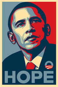
This is a poster of Obama’s 2008 presidential campaign. The poster is designed by Shepard Fairey. The artist used several layers to introduce a 3D effect. Tools the artist could’ve used include paint bucket, filters (to transform the texture from photo-alike to sketch-alike). The major steps for producing this poster would include setting multiple layers with each in different color, filtering, and using paint bucketing.
GRA 217 Section 5 Group 2
The official blog for GRA 217 with Sherri Taylor


This was certainly outlined using a filter and adjusted to provide the correct level of detail the designer wanted, then selectively colored using limited swatches to provide the shading and tone required.
This design is actually a trace from AP photographer Mannie Garcia’s photo. Last I heard there was an ongoing copyright battle still carrying-on in the court system. In any case the design it very well known now. I think this was made with pretty simple approach. Pen tool to make shapes and lines and then filling those shapes and increasing the stroke on the lines. It’s amazing that this piece was selling in art galleries for $1,000+ because it’s essentially a traced photo. What do you think?