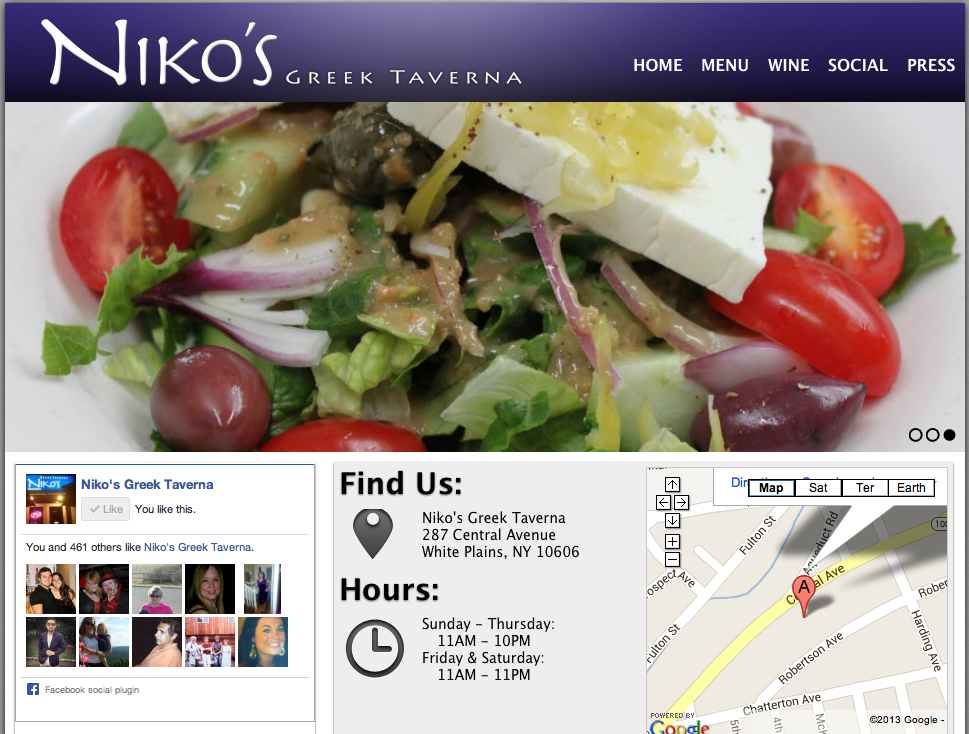
I absolutely love this website design. It’s clean, appetizing and easy to navigate. The name of the restaurant, Niko’s Greek Taverna, is right there in the top corner. Then, on the navigation bar, there lists home, menu, wine, social and press. These are all links that customers want to have access to before dining at the restaurant. Next, there is a picture flow; the screenshot is stuck on the salad photo, but there are other photos of a fish dish and people happily dining. In addition, on the home page there is a Facebook section, which allows people to “Like” the page right there and even see how many other people “Liked” the page as well. Furthermore, there is the restaurant address and hours of operation, which is super important because it is a common reason why people go to website pages in the first place. Lastly, it does not show on the screenshot here, but there are links to Niko’s Greek Taverna’s Facebook, Twitter and RSS pages.
http://www.nikostaverna.com/


I like how the website is organized: the navigation bar includes all the information we’ll possibly need as a customer. “Find us” and “Hours” sections are extremely helpful, which is why the designer puts in the home page. The size of the main picture is appropriate and eye-catching. The only thing I see that could be improved might be the typeface used on this website. It is readable though, but just not matching the wordmark very well..?
I like this website because it is very simple and clean cut. It is so easy to navigate around the page and nothing seems cluttered. I really like how the name of the restaurant has big font and then “greek taverna” are smaller to emphasize the Nikos. It’s also nice that everything is located on the homepage, like the map and the hours of operation. The three containers help with the organization pattern here, too! Good choice.