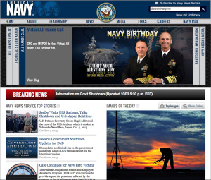
I like the visual hierarchy of this page. The arrangement of items leads you across the page from left to right, up and down in a very pleasing way. I also like the grouping of like items. It keeps everything on the page very neat and organized.
GRA 217 Section 5 Group 2
The official blog for GRA 217 with Sherri Taylor


I’m not a fan of the Navy website. I always thought it was a little too much one place. For example, too much emphasis on the top portion under the menu and less focus on the content of the headlines. Also I don’t like how the photo and headlines are across from each other. I always found that confusing because the photos of the day don’t correspond to the story headlines all the time. SImple is better right?