
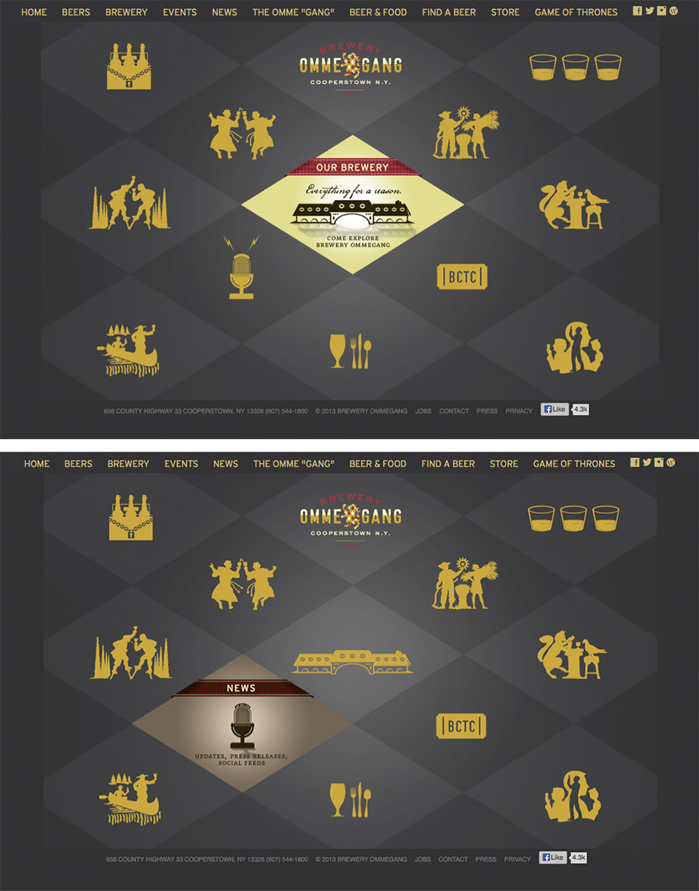
The website for Brewery Ommegang is simple and clean, using the same plaid motif they decorate bottles with, but in two shades of gray to allow other content to stand out in the bold yellow they chose for text and icons. When the mouse is rolled over any of the icons, the diamond containing that icon switches to a colored graphic with more information. Icons are silhouettes of designs used on bottles for each variety of beer they make along with complementary icons to represent the brewery, news, events etc.
I think this website has done a good job of creating a neat, sophisticated, yet organized webpage for brewery company. I especially like the idea of using the checkboard pattern and characters has dominant visual because it adds playful aspect to the brand.
I like the repetition of patterns, it lead the eye across the page. The entire website creates an amazing sense of three dimensional space. Everything about it is very appealing.