
 I chose 100 McDonald’s Moments as my favorite website because of its effectiveness in engaging the audience, showing brand personality, and and also enhancing brand image.
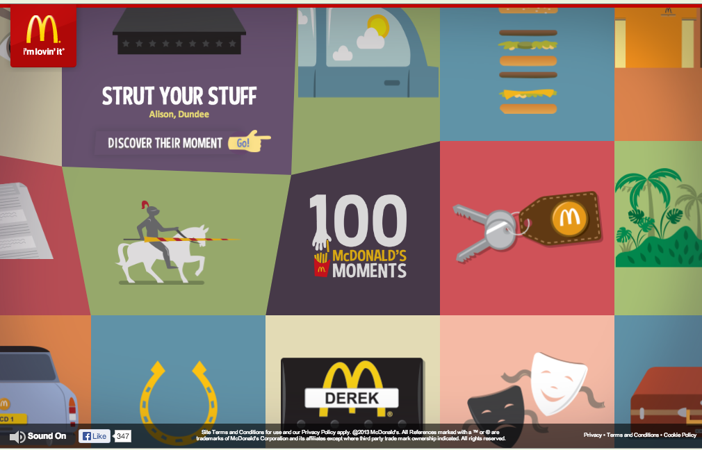
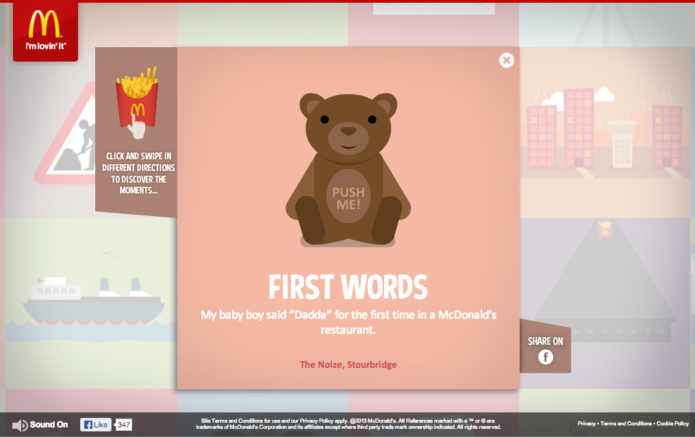
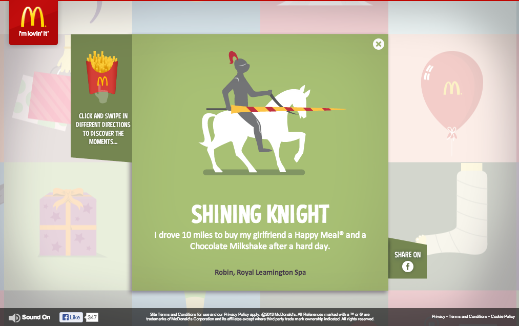
McDonald’s did a fantastic job of creating a web site that is purely created by engagements of its consumers. With the valuable anecdotes that consumers have sent, it raises the credibility and authenticity of their message to a whole new level.
Their use of color, gif motion, grid format, and typography are all fun, colorful, and original and it conveys the personality of McDonald’s excellently.
I really like this website because it looks very lovely and interesting. I tried to click different pictures and did have great fun. I agree with you that this creative website delivers the personality of McDonald’s very well.
McDonald’s definitely knows their key audience, which is children. When parents go onto McDonald’s website, they are obviously not going on themselves, but with their children as well, and this website graphically appeals to a younger generation. The primary colors that are used are universal with children’s themes and the pictures are creatively designed to be an attraction as well. The fonts that are used are playful and fun and keep the viewer interested.