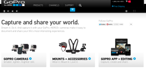
I love the GoPro website for its visual design. Go Pro is a universally renowned sporting and extreme activity camera. It takes incredible photos and videos the most dangerous and intense activities in the world while in some of the most extreme surroundings.
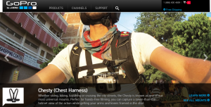
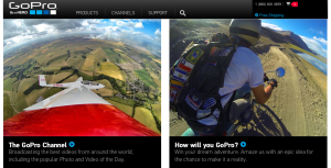
With all this in mind the web designers knew that they had to make a website as appealing as the product. This website is absolutely filled with photos and videos on every page. Instead of reading all the things you can do with the Go Pro, they show you with a video example.
All the products have been expertly photographed and are on a very visual display. Text is at a minimum and is very simple and readable whenever it is used. Social media is everywhere and the chance to win some of this companies amazing products is always shown.
This website will make anyone, myself included want to buy a GoPro!


Agreed! GoPro is amazing! I like their website for the same reasons I like the Apple website. They’re simple, easy to navigate and put the product at the forefront with amazing demo-videos. I really like how they always have their products floating in white space too. Simple is better.
I think it’s important for a website to reflect their products. For GoPro, they effectively manage to illustrate their visual nature of their products. Not to mention, the website adds the ability to showcase the quality photography and videography that their products are known for.