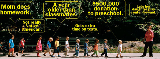
Head: Ethical Parenting
Deck: Is there such a thing? Just ask your children.
http://nymag.com/news/features/ethical-parenting-2013-10/

Head: Ethical Parenting
Deck: Is there such a thing? Just ask your children.
http://nymag.com/news/features/ethical-parenting-2013-10/
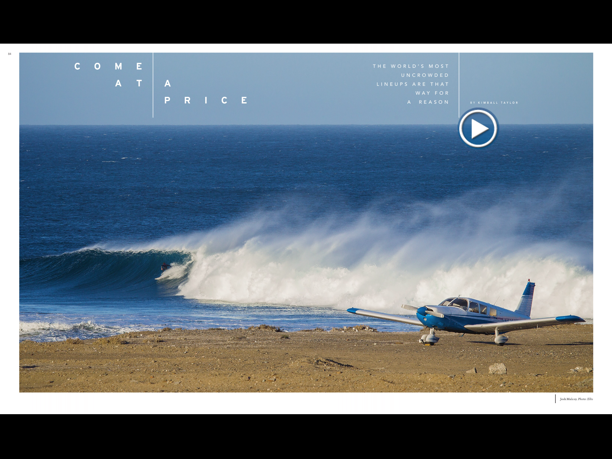
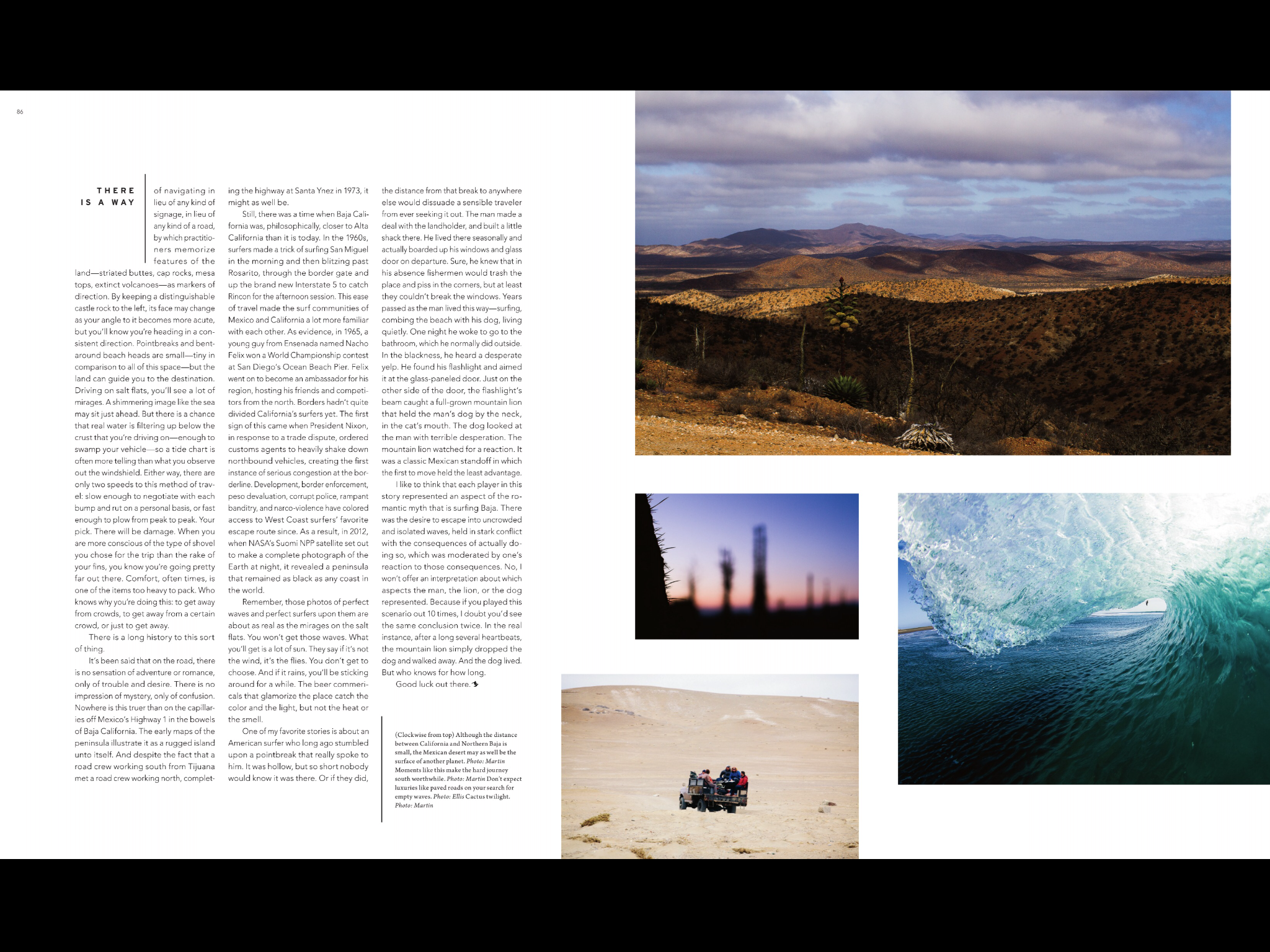
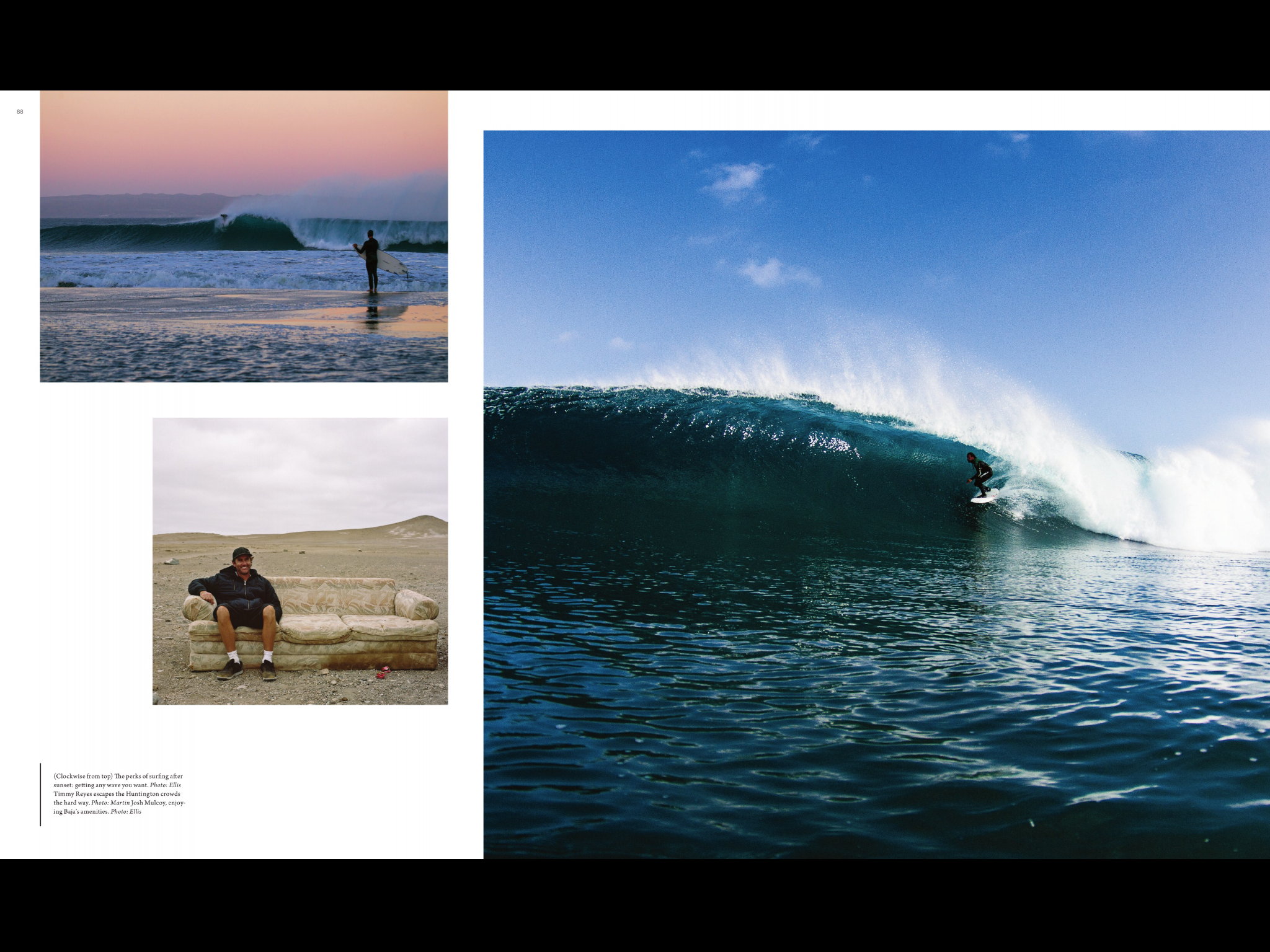
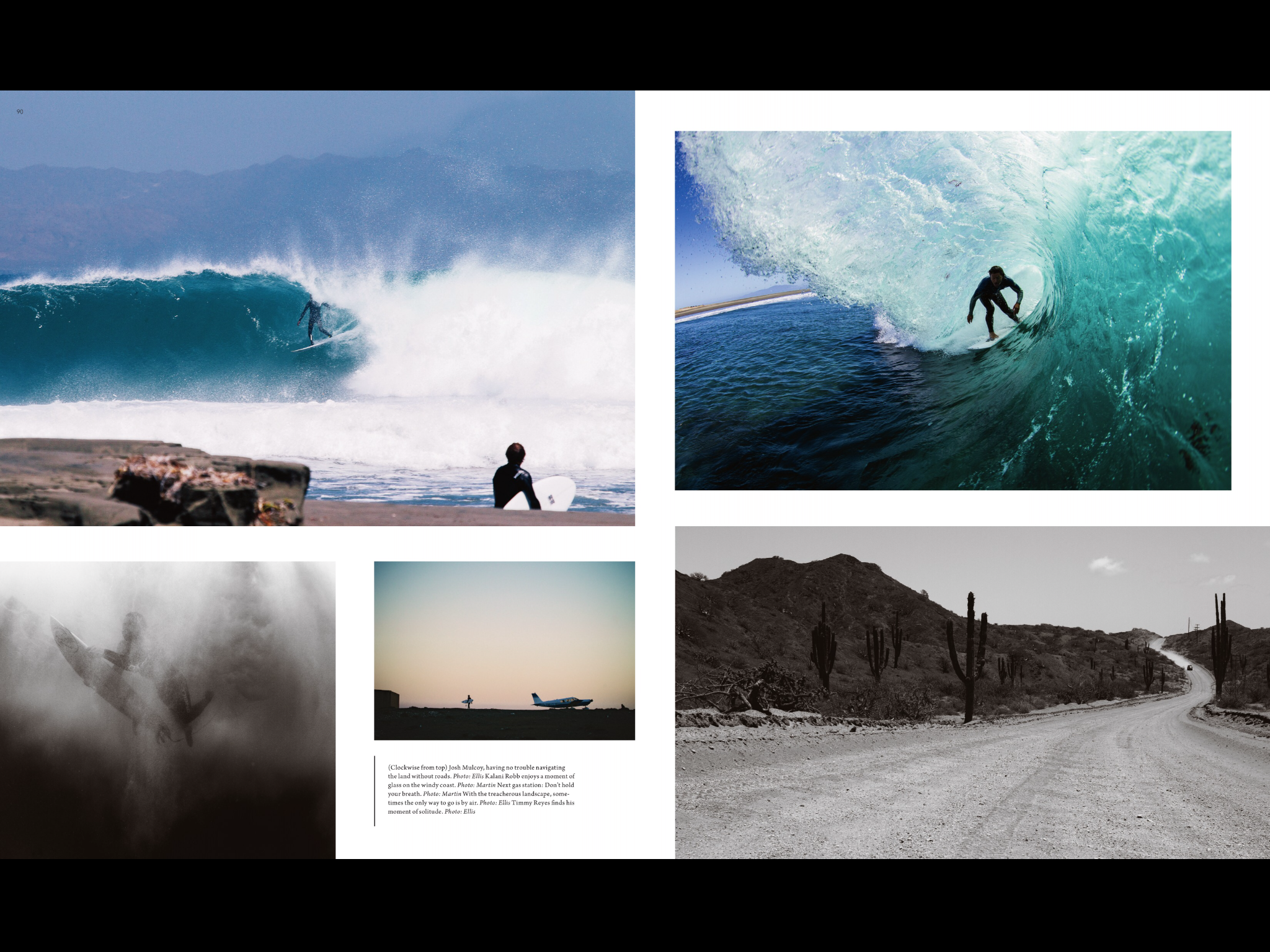
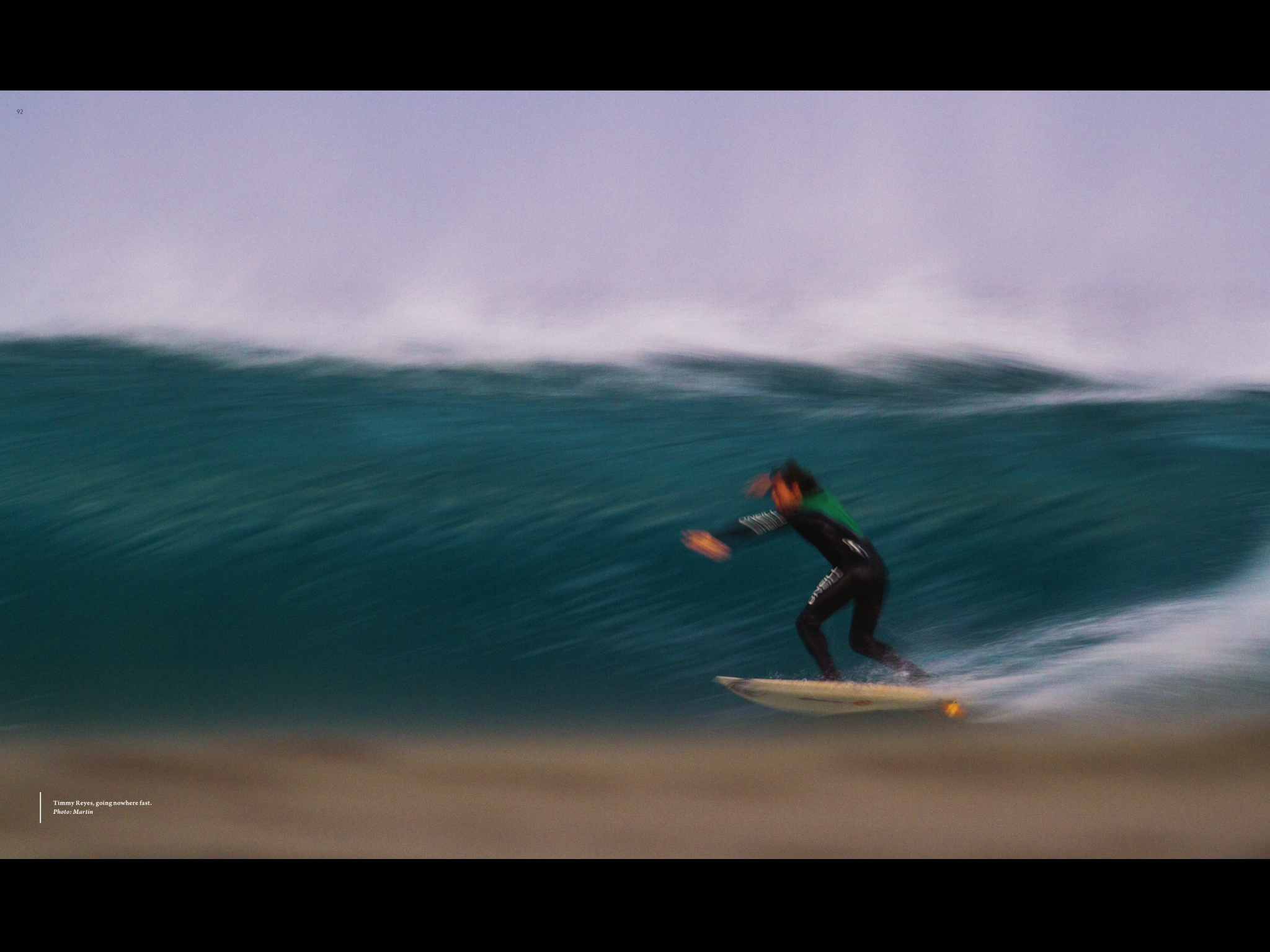 This is an article from Surfer Magazine. I really like this magazines layout because it uses so many pictures to tell the story and it breaks all kinds of rules for magazine layout. Like the center fold is not consistent and so pulls your eye from one page to the next. I also like that they normally put a sweet double truck photo in most of there articles. I also really like the use of color, there’s always a consistent with creating a theme and a feel to each article.
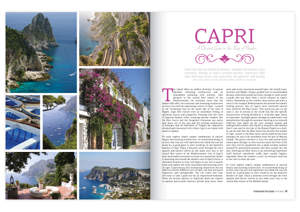
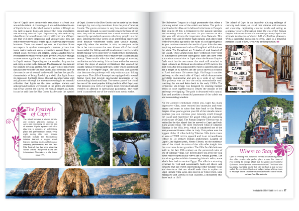
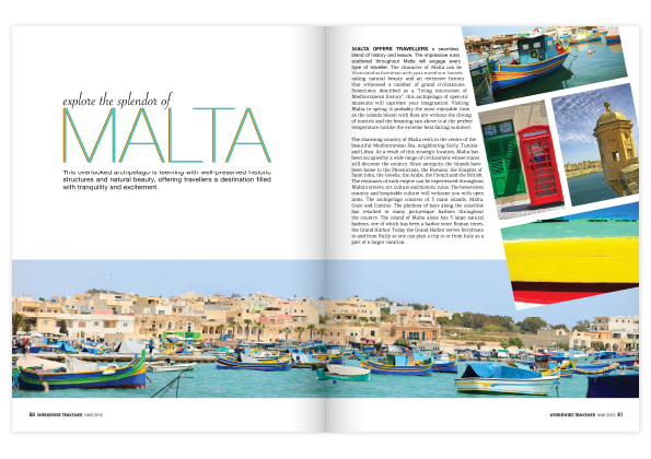
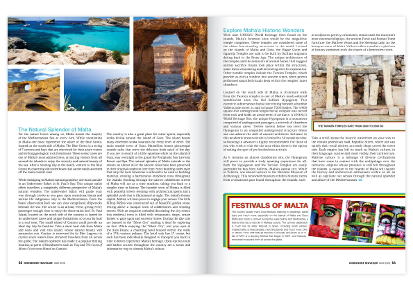 I LOVE everything travel and this is the quintessential magazine spread that makes you want to pack your bags, hope on a plane and lose yourself in explorative bliss. These two spreads are reasonably simple in their style with a lot of white space, uniformed typefaces and fantastic use of color. Looking at the gestalt theory #6, which says that everything contributes the greater whole, I can really see how each individual component plays its own part to make a really striking end products. Color has been used really effectively in this piece with the designer pulling out the most attractive and vivid shade of each photo and using it in the typefaces of the headings. Photos have been placed in a grid like form with the exception of the third page where it is on an angle, giving the page a very aesthetically pleasing look. Overall I think it is a very appealing and effective spread.
Capri and Malta anyone?
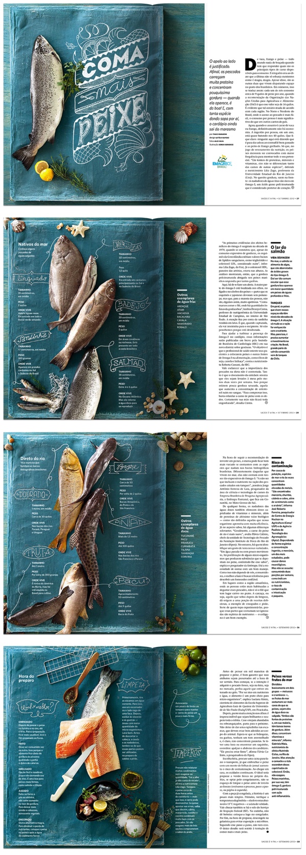
I like this layout especially because of its creativity and originality of using a fabric instead of regular table to display the fish. I also love their use of color, orange, blue (turquois), yellow, and green seems to be complementary and supplementary to each other.
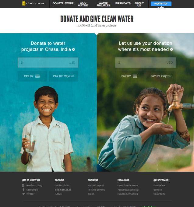
This is the “Donate” page for Charity : Water website. I specifically chose this page instead of the conventional “Home” page because I wanted to to see the organizations use of photography in a page that is the most essential for convincing or persuading audience to take action.
This is the view of the website after I zoomed out three times to get the whole layout of he page. In original setting, the two photos will be bigger than the window itself that I need to scroll down to finish the photo. I love their use of two images of very cute children who serves as the faces of the mission of this organization, and thus very relevant. The use of complementary colors attracts the viewers more to the page and the contents on the photo (donate). Also, the color used for typeface contrasts with the photo that it is very legible. The target audience could be seen as in the wide range of teenagers to seniors. The call-to-action is purposely on the photo so that the message will associate with the beautiful photos, evoking ethos to the audience.
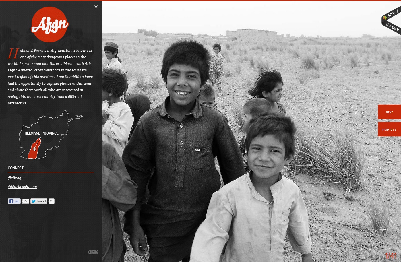
In this website, the photo of the children in grayscale provides a means of emphasis in the orange-red type and graphics. The heat of the color contrasted with the black and white of the photo creates key emphasis of the Afgn logo, the dropcap, the Helmand Province graphic, and the previous and next buttons. All of the emphasized aspects are vital to the webpage. However, they do not stand out from the picture, which creates a friendly face for the area and detracts from the Islamist extremist stereotypes of the region. The photo is covered up by the black transparency on the left, but the whiteness of the boy’s smile captures the initial attention in the site.
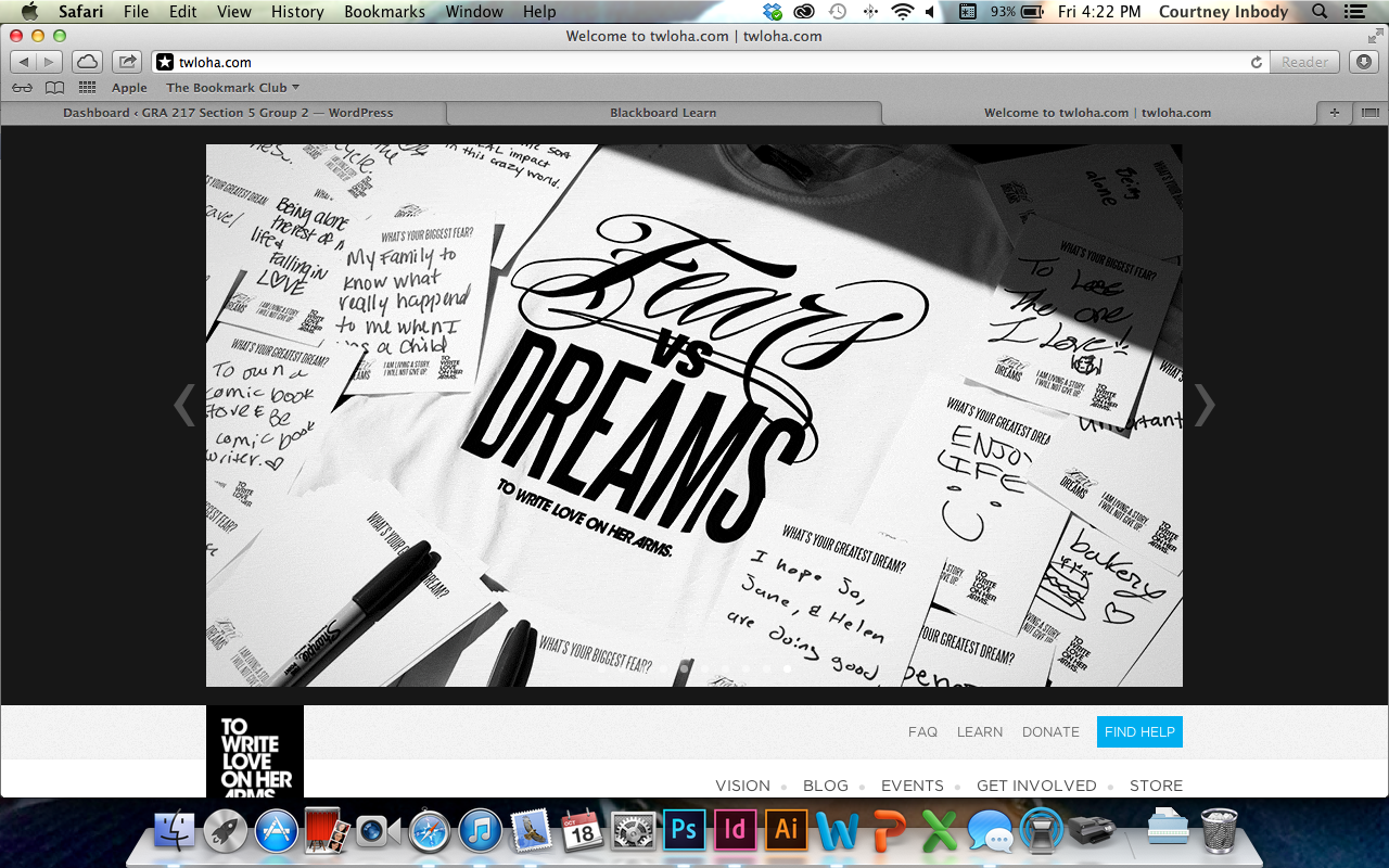
To Write Love on Her Arms is a campaign designed to allow anyone to express themselves as the wonderful individuals they are. TWLOHA aims to help people who are struggling with depression, addiction, self-injury, and suicide. Photography has always been a large part of this website, specifically because images of self harm, in any form, were used to encourage this sort of harm by others, and TWLOHA tried to be the movement to stop that. The black and white color scheme, and image at the top of the page, serves to provide a striking contrast to the world of color that we live in. Sometimes, dealing with any type of harm, can be seen as black and white, and the color that brightens a day has to be found by one’s support system – the point of this movement. The rest of the pages throughout this website are coded to an image, and the images have something to do with that specific page.
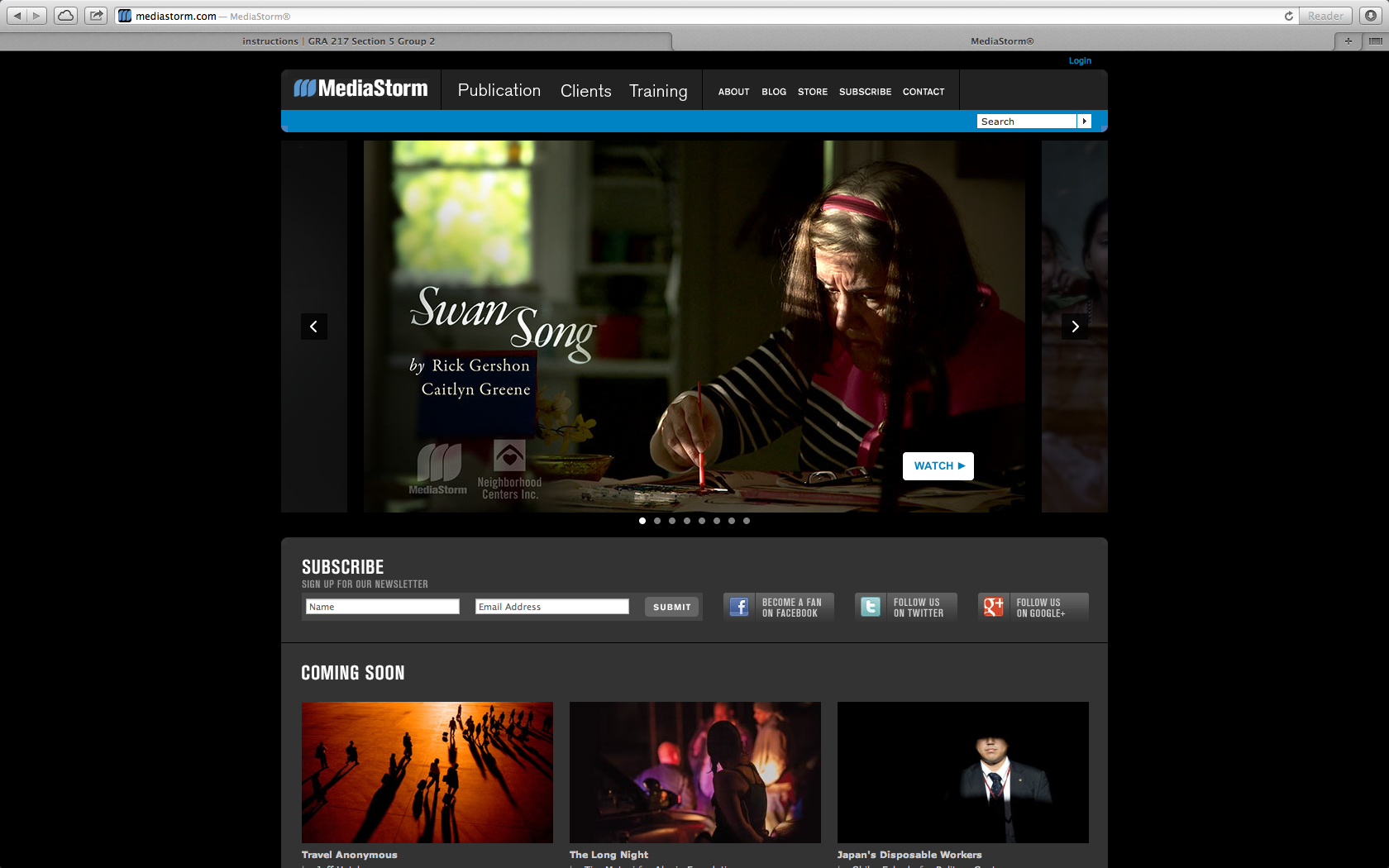
I chose Media Storm as a ideal site that uses photography to draw in an audience. The website is a place to display media and showcase photography. Here they use a key frame to draw the audience into the site and click on the video to see the story. The audience is for everyone, but probably mostly for other content creators to see what others are doing in the field. In this case the key frames in the videos are actually the bulk of the content making it user friendly and easy to navigate.
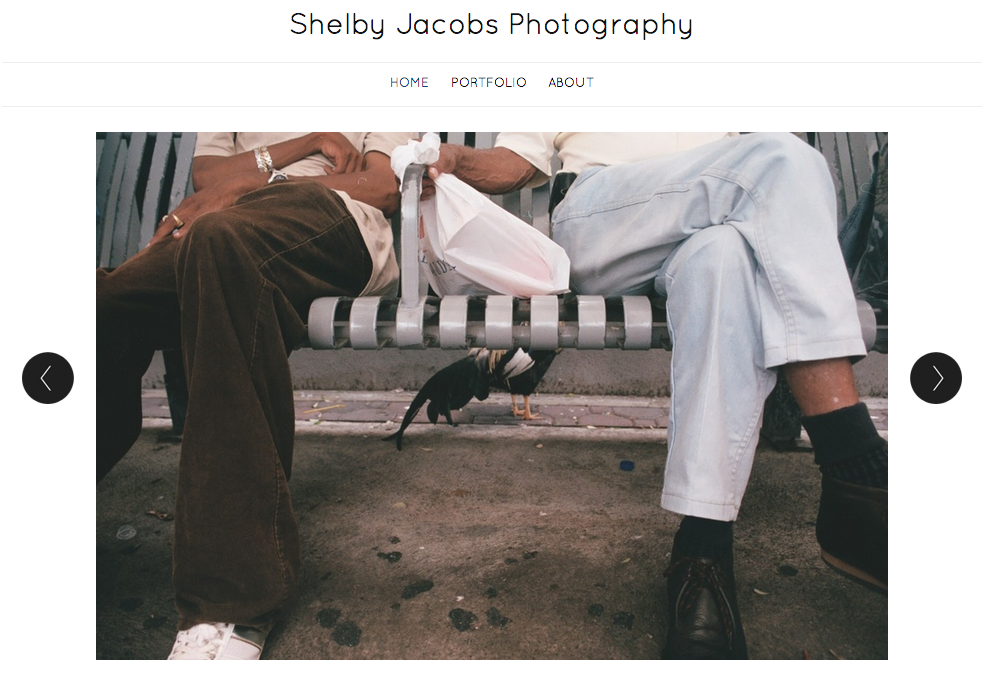
The large photo here was used as a visual element to effectively communicate with its viewers. Since this is a portfolio of Shelby Jacobs’ photography, the target audience of this is anyone who is interested in photography. She choose this particular image because it was simple, but could be interpreted in multiple ways. She also addressed a relationship between two people. According to Professor Taylor, showing relationships between people in photos is very important because it helps the viewers relate to the image. Additionally, I really like how the photo is taking up most of the space on the page. According to Bruni’s article, big photos sell! I also like how she used dark text over a light background. It helps the text stand out to the viewer.
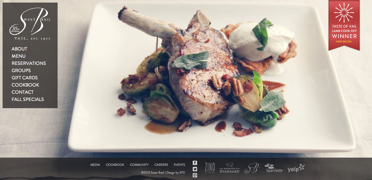
The photo on this website was used to give the viewer a sense of the restaurant. It is apparent by the appealing visual presentation, that the restaurant serves upscale food. The target audience is people who can afford and are willing to pay for an expensive/luxurious meal. The designer chose this image to entice the viewer to make a reservation and come to the restaurant. The visual works really well with the content on the page as well. The bone on the lamb points to the navigation and directs the viewer’s eye to the information about the restaurant. The footer is appropriately placed below the edge of the plate. This is an excellent use of a photo background; I know I found the food very enticing.