You have a really strong visual and I like how it points to the most important word on the poster. I like how you draw the color red from the visual down to the highlight the word OWN throughout the poster. You have a very visually interesting poster.
Yidi, I agree with Peggy. You have a very strong visual. The flower is also drawn very well. I love how you made the word “OWN” stand out with red in both of its places. In addition, I like how you chose the color red because it matches that front petal on the flower. The information regarding the date/time is very clear. I would just change this two things. One, put a period after Sept. and Oct. Two, take out the space between between Syracuse and the comma after it. Otherwise, good job!
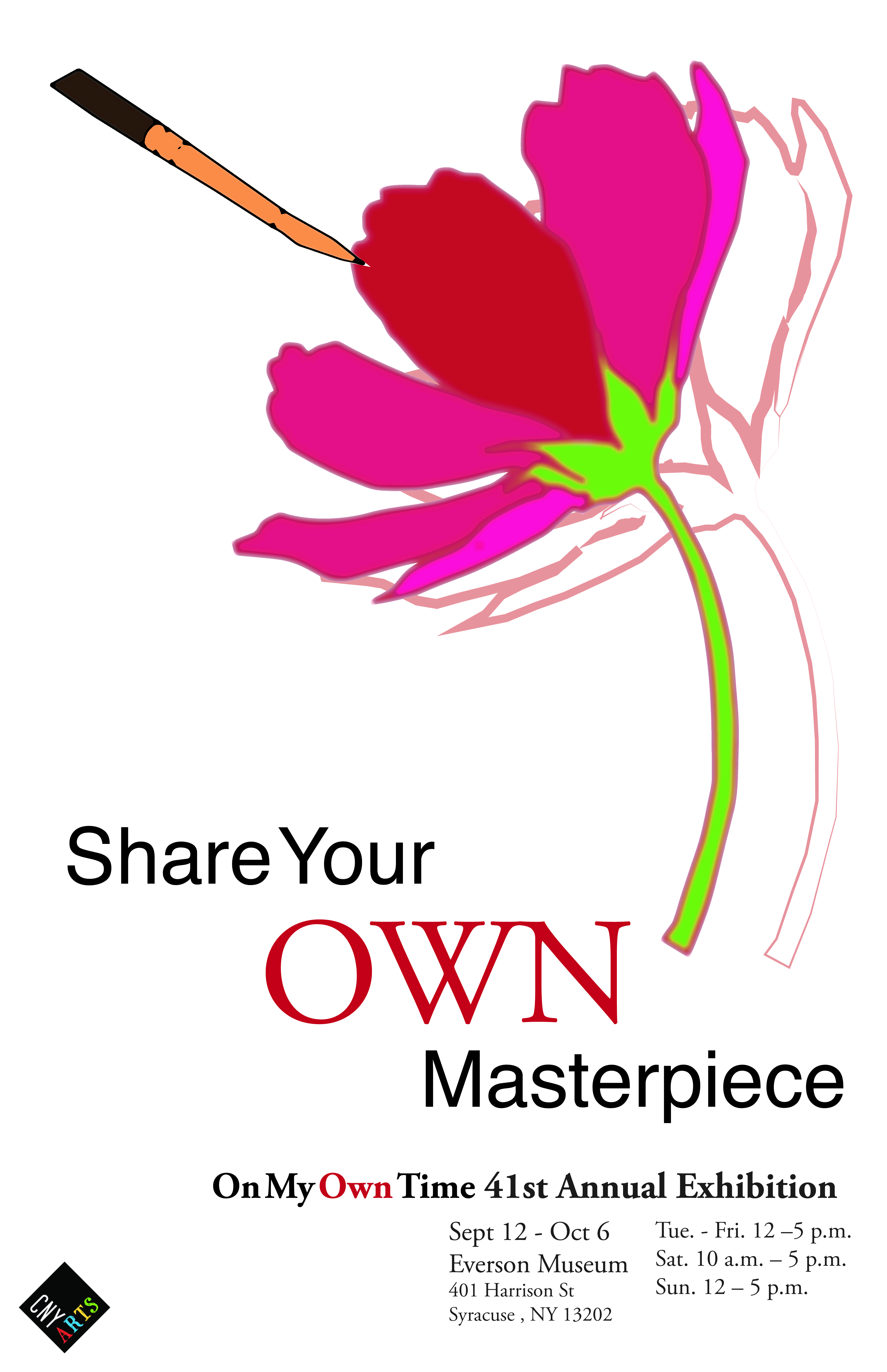