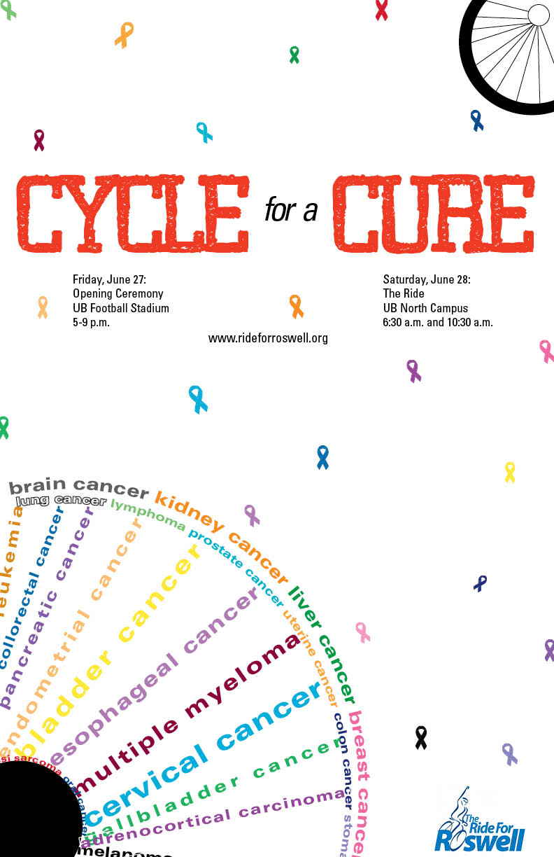
I think it is very clever how you created the bicycle wheel out of words (specifically the names of the cancers/diseases). I really the the simple background with the subtle but effective colorful confetti ribbons. The one criticism I have would be to lighten the center of the wheel… the black is very distracting and pulls my eyes away from the important information.
I agree with all of the above, the heavy black wheel hub is distracting and doesn’t fit with the light airy feel of the rest of the poster. I would also either remove the wheel in the upper right or replace it with a smaller version of the word wheel. I think slightly more variation in size would help the nice random effect of the colored ribbon backgrounds. Maybe interspersing some tiny bikes in the same colors as the ribbons would be nice too.
Overall, I like the design and really like the use of a vibrant red to make you headline stand out and emphasize the most important words in your headline.