2 thoughts on “Salvation Army National Command Poster”
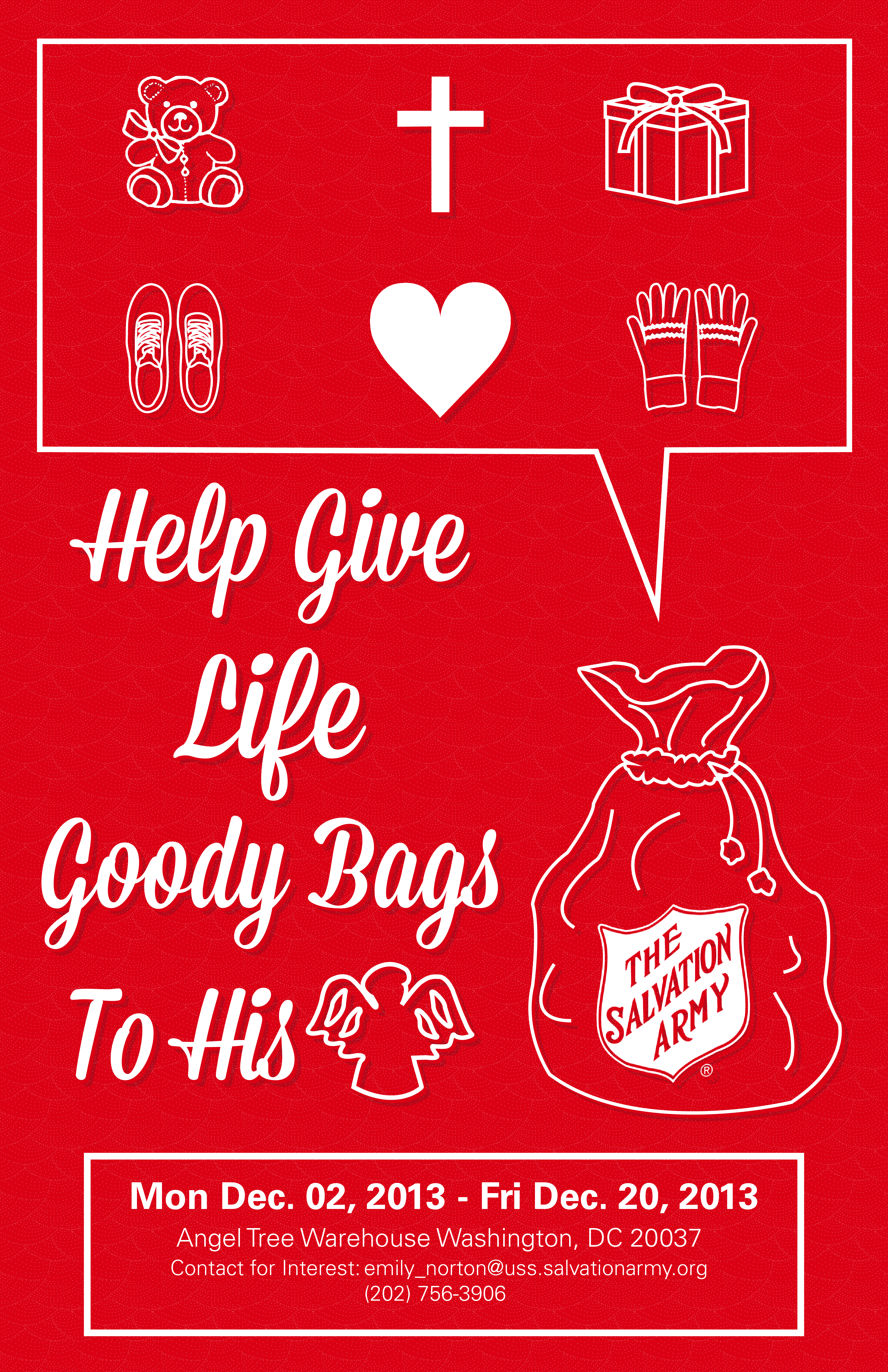
I love your poster. It is so simple yet very effective. The use of red as your primary color is great because it reminds me of Christmas and Salvation Army. I really like how you repeated the use of the box to hold the information and the visual. It is clear and easy to understand. Great job!
I love this poster. It reads really well. The white letter stand out against the red background and your conceptual headline works really well with your graphics. All of your elements create a really strong Christmas-like feeling.