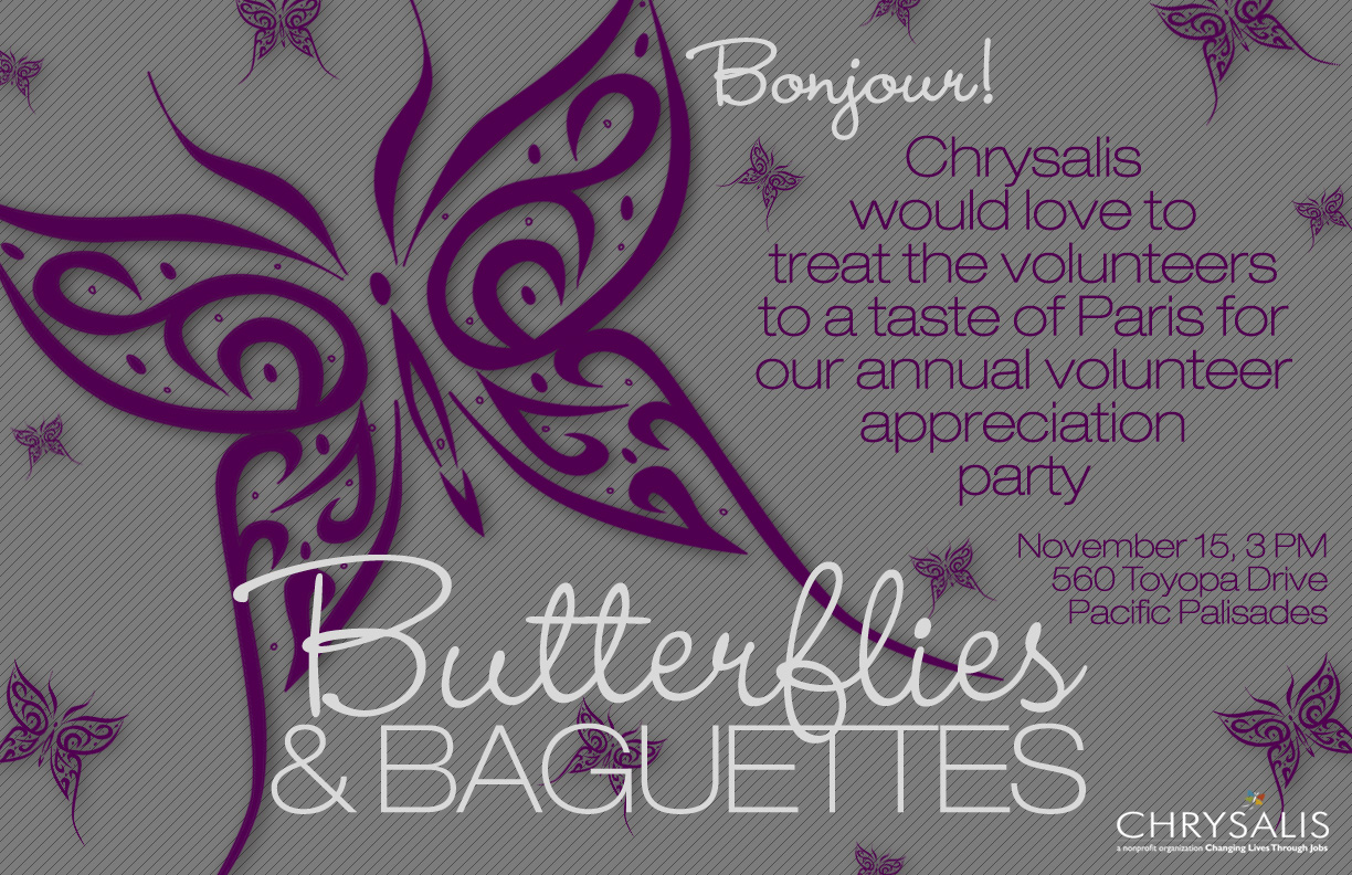
Love the typeface you choose for the headline. It’s very eye-catching and stylish. The repetition of butterflies in the background matches your headline very well. The only suggestion I have is maybe to allow more white space?
I really enjoy the look of your poster. The text and the butterfly work together really well. Also, the contrast between the two typefaces make them very distinct and readable. I suggest having a less-busy background to make that big butterfly even more dominant in the space.