
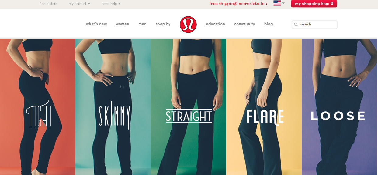
I think the Lululemon website is very successful with effectively incorporating the gestalt principles of design. First off, their logo shows an exaggerated letter “a”, which when clearly looked at and deciphered displays the continuation element. A viewers eye is drawn from the bottom corner curve, up to the top arch and back down, to the point where our brain can close the “a”. Also the figure ground principle is clear too; the red background allows the white symbol to pop out of the ground.
The website follow similar principles. We see proximity and alignment with the typography on the webpage because all of the drop down lists and bar at the top, are written in the same text and size and located close to each other. Also, the models are close to each other, leaving no white space, helping to draw the eyes up to the top of the webpage. However, the type on the pant styles are all unique, which I think help the different kinds stand out amongst each other. The models also contribute to visual hierarchy, leading the viewers eye up to the top of the webpage where the drop down lists are. The color of the background on the site is also white, allowing not only the logo to pop, but also the colors in each style pant to come off the page and be apparent.
I love this site…and their clothes.
Sarah, you made good points. This website includes figure and ground because the bodies of the women stand out against their surroundings. There is also proximity and alignment because the white words are used consistently through the page. Although they are different typefaces, I think it is still effective. Overall, I like it a lot.