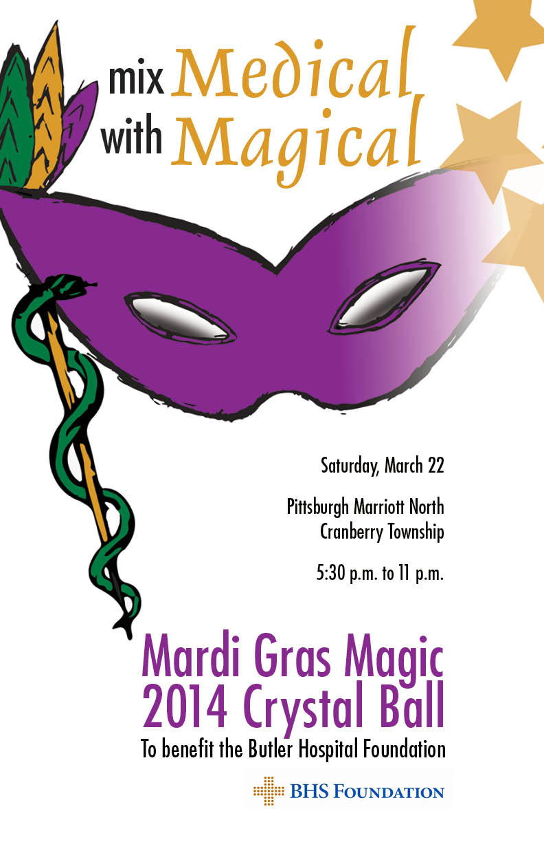
Peggy, I absolutely love this poster. I think the design is so well thought of and put together. It’s clean, simple, and to the point. I love how the bottom of the mask is pointing to the description of the event. I also love how the stars at the top of the page and the mask go off the page. I think the gold, purple and green colors that you used blend together very well. The only thing I would change is the way the time is written out. If I were you, I would’ve written “5:30 – 11 p.m.”
Peggy- I am glad to see your final poster so well done! I especially like how you decided to use the medical symbol as the handle of the mask for the masquerade. This spin really adds fun and creativity to your poster. I also like the grouping and separation of your copy. If I were to suggest one thing, maybe changing the background to dark color to give the sense that it is masquerade held at night time could have been good too. But overall, nice job!