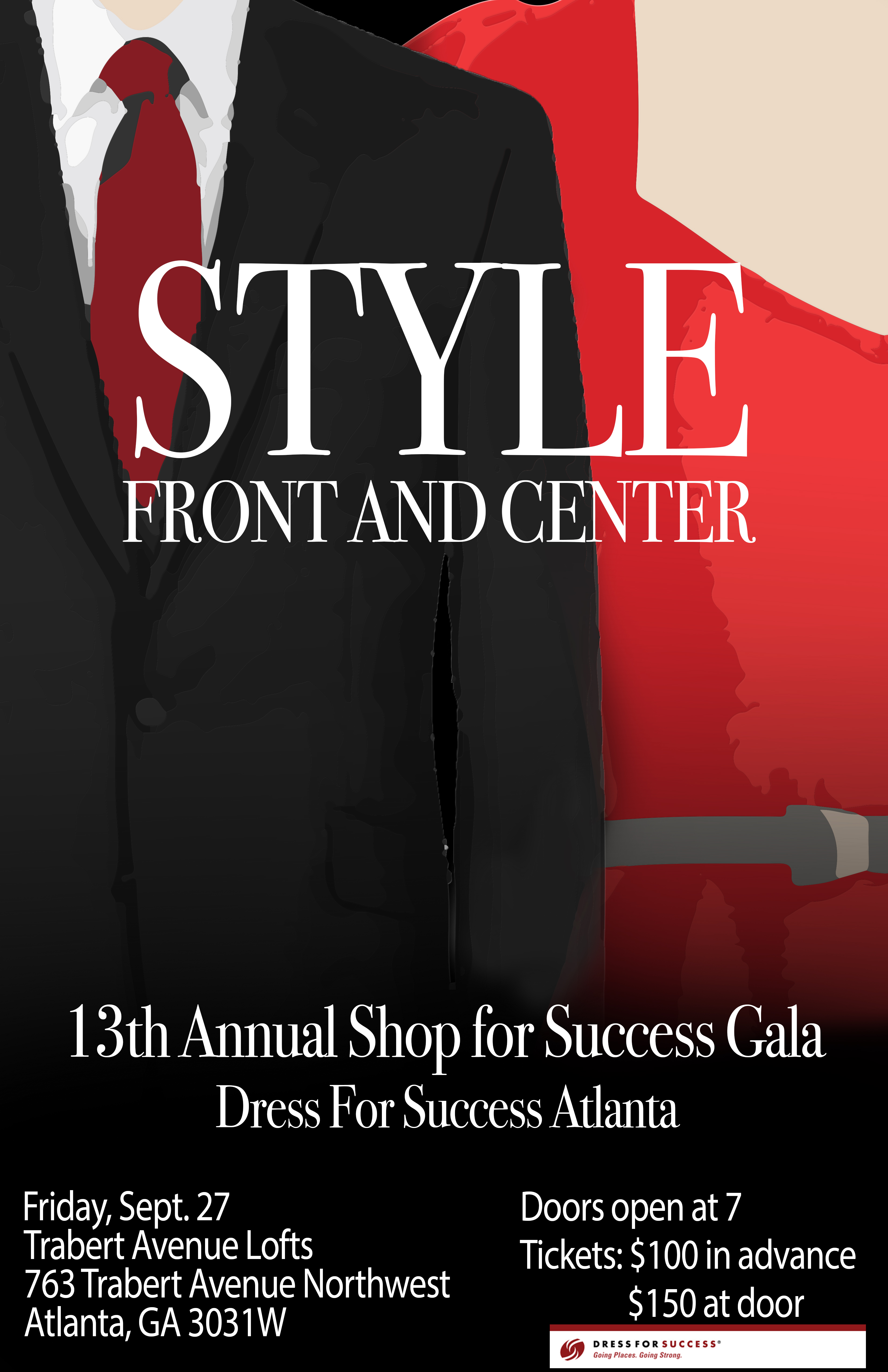
I like how you organized hierarchy of your visuals and copy. I especially like the typeface you used because it brings the feeling of sophistication and formality. I also like how you used red and black as dominant colors and repeated them throughout. One thing I would recommend for improvement is to be more neat when tracing the dominant visual because when I see the large version of the poster, the tracing seems to be a bit messy. However, apart from that, the general look is really great.
I like this poster! I agree with Euginie that the typeface works very well. And the white color also make the words very outstanding. The visual is also so related to the event that people can know what the event is about once they see this poster.