
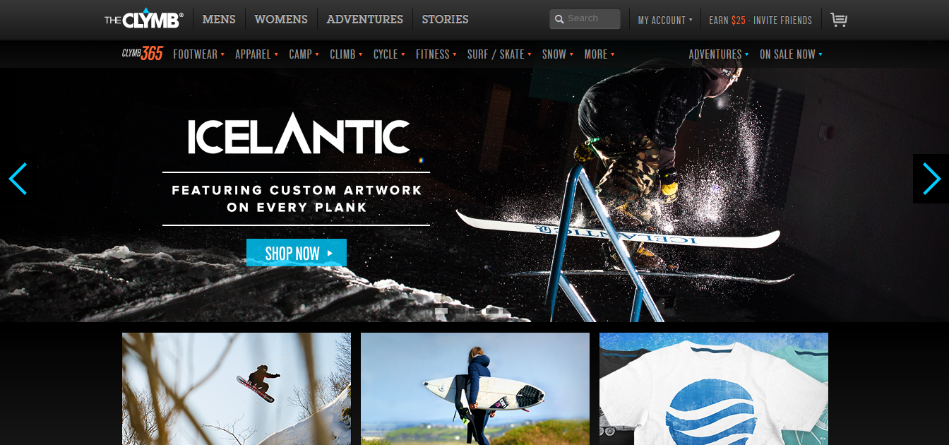
The Clymb is a discount outdoor clothing/gear website. Their business is all web based so it is very important they have an easy and accessible website design.
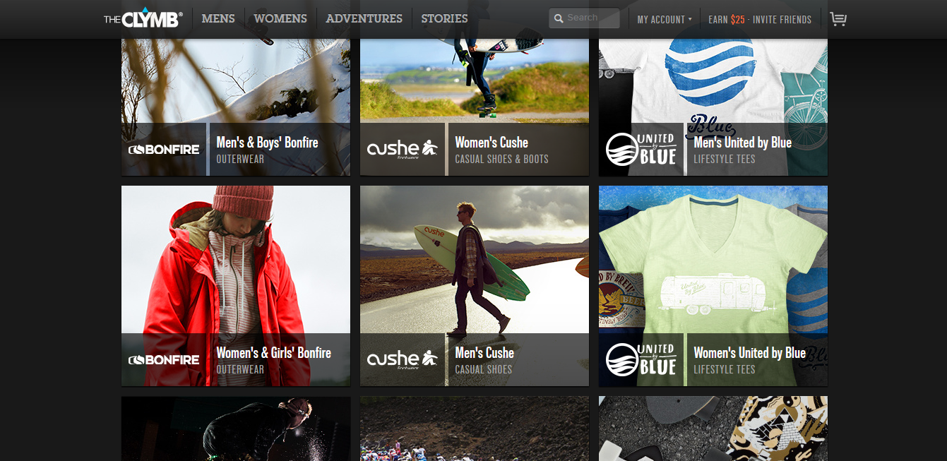
- figure and ground: The Clymb uses a dark background which allows the viewer to see the products clearly.
- proximity and alignment: The site uses two types of fonts, and the dark and light grey as well as the light blue colors throughout the website which creates unity.
- continuation: The site is very linear and organized. They decided to create square blocks to place the information and products they are selling in.
- visual hierarchy: Their layout is simple which is necessary for the site to place emphasis on the products they are selling. Most everything is uniform in size and color because each thing they are selling is equally important. The Clymb logo is large at the top of the page and the categories begin to decrease in size as you go to another sub category.