
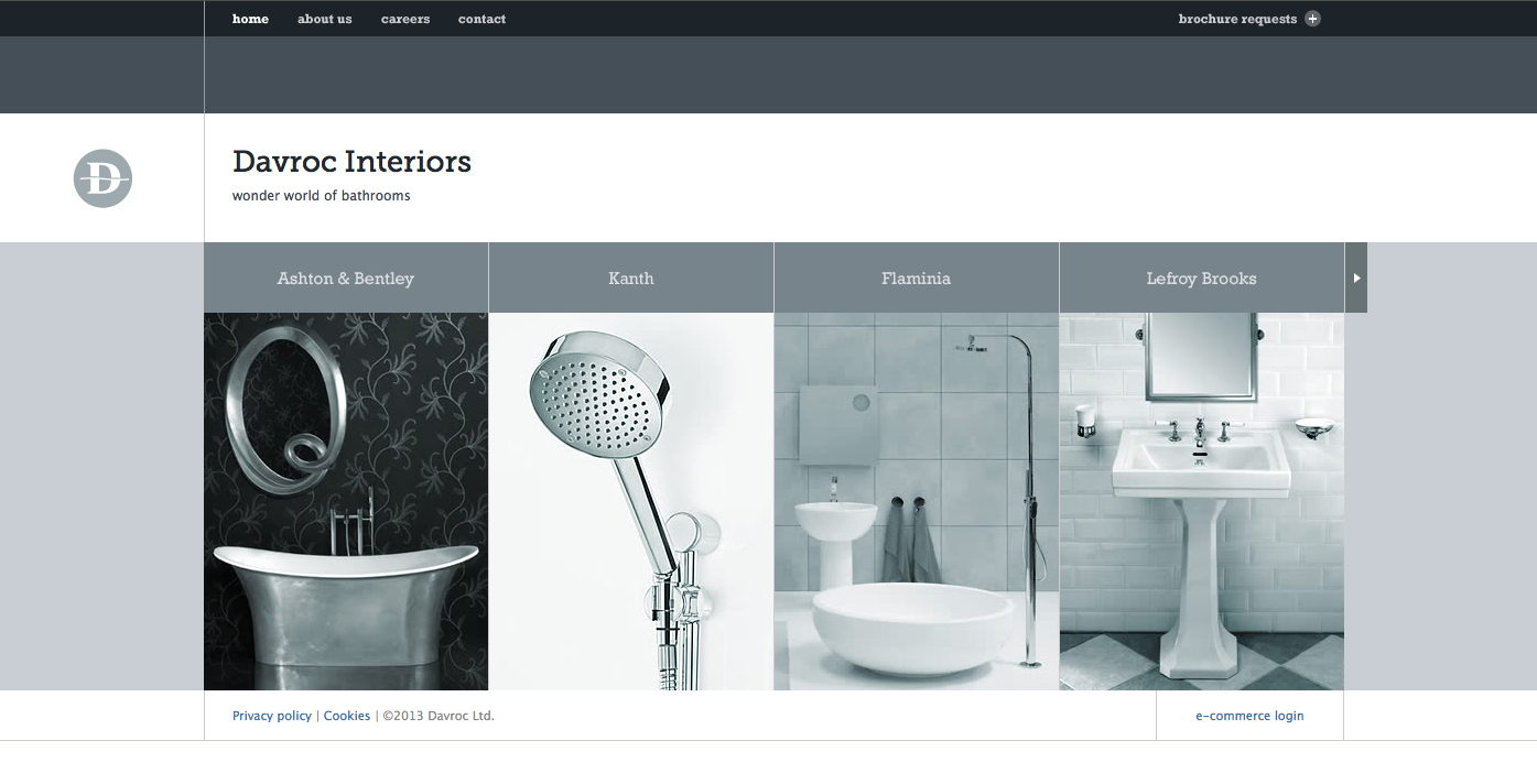
The Davroc Interiors website uses sever gestalt principles including a very narrow color palette of various shades of bluish gray to simplify the design and ensure that the photos all compliment each other. The site also uses generous whitespace throughout and a minimum of text in simple fonts to reiterate the minimalist design. Everything also uses a very clear alignment to keep order to the flow of the site.
I like the muted colors of this website. The greys really work well and create an easy to read website. The text works really well.
They multi shades of grey work really well because they create an image that the consumer would want to see in their own home. The overall look achieves one of sophistication and quality – two characteristics that are crucial when you are selling an idea of how a home should be composed through the choice of its separate components.Overall this website uses simple but effective choices and allows a heirachy of visual over verbal to shine through but not to the point where the text is unreadable or unclear, it just simply doesn’t effect the flow with the overall website design.
I’m guessing that if there was some solid evidence to support the 10 year old contentions that they did, then it must have been discovered at least since Bush left office, because there’s no way that they would have sat on that one for more than a couple of seconds.
[url=http://www.hubzone.us.com/js/moncler2013.aspx?5]cheap moncler men shoes[/url]