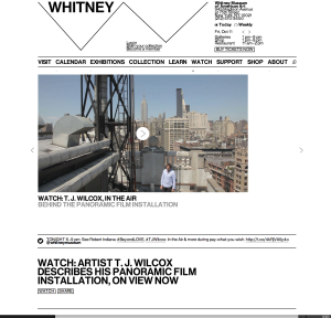
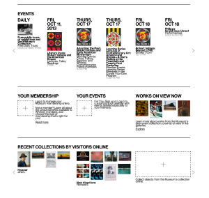
This website was newly published by the Whitney Museum of American Arts. I think it serves as a good example for other museums how to make pages readable and clear. It uses white color as a background and black color for most words, and the visuals are very colorful. Hence, it is such a great contrast that objects can easily stand out. We can see that it groups information well under the “EVENTS” column. Top is dates, middle is visuals and bottom is the name and other information. White space is between each event. Each group of information can be clearly consider as a unity and separate with each other. Regarding visual hierarchy, the website uses the same font but different colors, different sizes, bold or regular, and upper or lower cases. For example, it uses black color, bigger size and upper case for the dates in EVENT column, while uses smaller size and lower case for the events’ names. And it uses grey colors, for the least important information—the time.
GRA 217 Section 5 Group 2
The official blog for GRA 217 with Sherri Taylor


I really like the grouping of this site. All of the like items are located in the same area, and the generous amount of white space helps the reader navigate through the site easily.