
No website needs to be more visually appealing and attractive than a website trying to sell an object/item to its viewers.Websites that are the home base for selling clothes and shoes need to be universally simple to use while portraying their products as expertly as possible.
The Australian shoe/boot/slipper manufacturer Ugg’s has progessviely become more and more popular on an international scale. Products are shipped worldwide so the website that advertises its goods may send the viewer a message of quality and luxury – two characteristics that this company is known for.
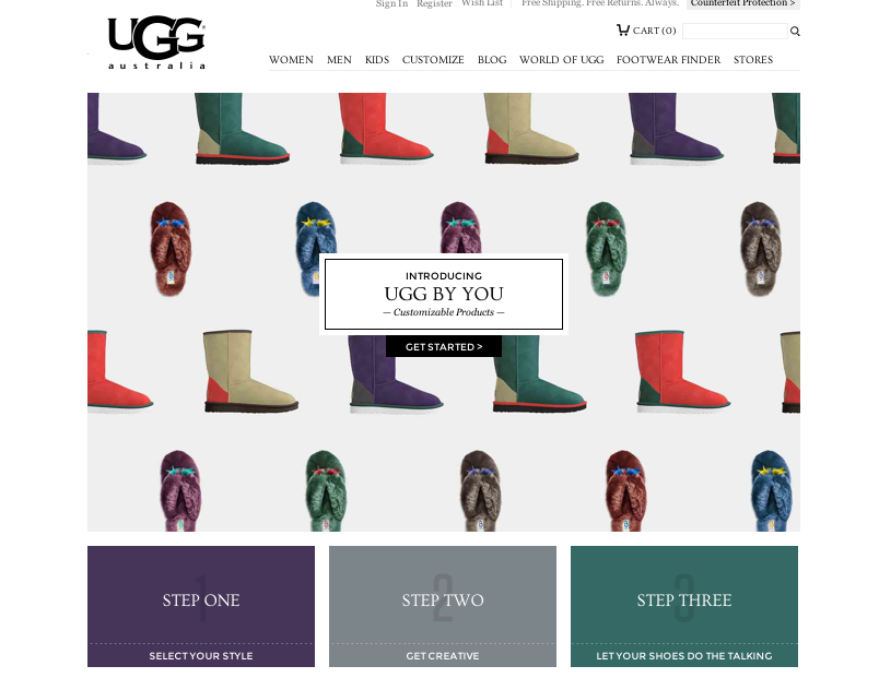
Figure and ground: The Ugg website does a great job of using white space. Products are used in appealing photography, however, when shopping for an individual piece, it stands alone. The foreground is not interrupted by a busy background. It is clean, simply and visually appealing.
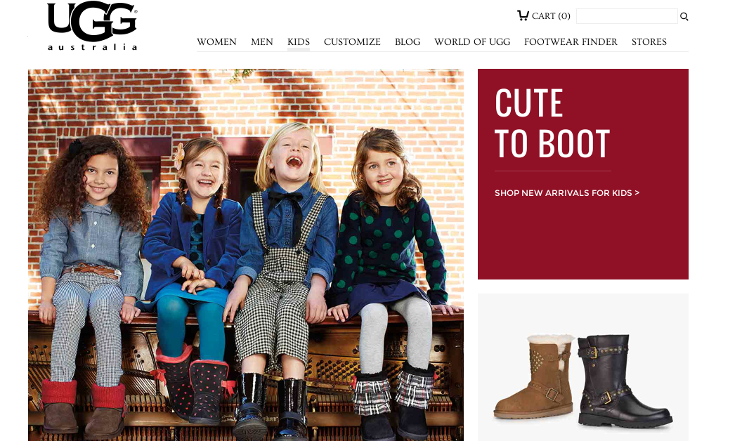 Proximity and alignment: The website does a great job on continuity throughout its pages. All typefaces are the same apart from the companies iconic logo which stands tall and strong on the top left hand corner of every page. Colors are explosive and appealing, but they all stay within the ‘prime colors’ zone and mix very well. Colors are also in their block for, they are not patterned or textured, just simply and uniformed.
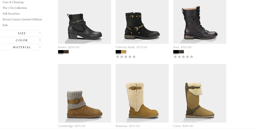 Lastly, visual heirachy is used in the display pictures that are feature points. There is quality photography throughout the site which features some of Uggs most popular products. The actual items for sale are separated by neat and easy to navigate boxs. Overall it is a great website.