
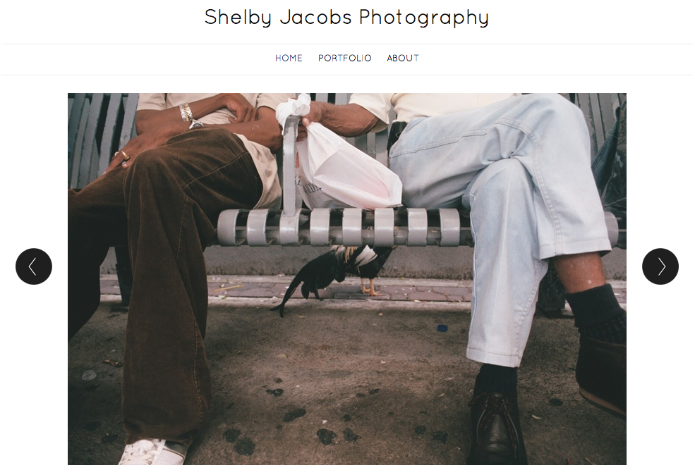
The large photo here was used as a visual element to effectively communicate with its viewers. Since this is a portfolio of Shelby Jacobs’ photography, the target audience of this is anyone who is interested in photography. She choose this particular image because it was simple, but could be interpreted in multiple ways. She also addressed a relationship between two people. According to Professor Taylor, showing relationships between people in photos is very important because it helps the viewers relate to the image. Additionally, I really like how the photo is taking up most of the space on the page. According to Bruni’s article, big photos sell! I also like how she used dark text over a light background. It helps the text stand out to the viewer.
I really like the cropping that is done on this picture. It is cool that we can tell the relationship between two people without even seeing their faces. I wish she had a caption for the picture or at least a name for it. I like the simple layout that this photographer uses for her site. It is simply organized and allows for the reader to focus first, and foremost, on the pictures.
I like this photo on the website. The cropping really shows us the relationship between the two people, displaying how good of a photographer Shelby is too. I also like how the photograph is so large and the links at the top are small, but visible. It is clear that this is a photographers site because the picture is emphasized.