
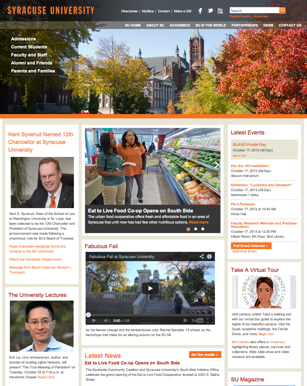
This is the homepage of Syracuse University’s official website. Photos are used very effectively on this page. The big picture in the header shows the current season in Syracuse, giving readers a sense of what the place SU sits looks like. Also, the picture blends greatly into the navigation bar. Pictures on the left side are also very effectively used, considered the text information it provides. Headshots in those pictures are clear — the background is blurred, making the subjects popping out. Also, picture in the main section also looks great — the photo is sharp; it has rich colors in it, which makes the photo look fun and interesting. It also relates closely to the story it is covering.
Jingai, I have mixed feelings about the photos in this website design. My biggest complain is that there are clumping photos and paragraphs. It adds a lot to one page, and it confuses the viewer. Other than that, I like how the headshots of the people are all pretty much the same size. I also like the photo of the campus on the top, but I wish the photo took up more space on the page. According to the article in the instructions, big images sell!
I agree that the visual hierarchy is done well on the Syracuse page. I just wish that the head size in the head-shots were the same size. I do love the top picture on the website that shows Syracuse in the fall season. It is beautiful and eye-catching, and it is darker on the left side where the navigation is, so we can read what is written.