
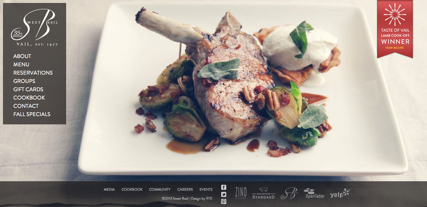
The photo on this website was used to give the viewer a sense of the restaurant. It is apparent by the appealing visual presentation, that the restaurant serves upscale food. The target audience is people who can afford and are willing to pay for an expensive/luxurious meal. The designer chose this image to entice the viewer to make a reservation and come to the restaurant. The visual works really well with the content on the page as well. The bone on the lamb points to the navigation and directs the viewer’s eye to the information about the restaurant. The footer is appropriately placed below the edge of the plate. This is an excellent use of a photo background; I know I found the food very enticing.
Peggy, very good points. I think the photo is used very well. For one, it looks absolutely delicious, which I’m sure, is a product of what they serve. The viewers are successfully draws attention to the image. Since the designers wanted to use light-colored text over a light-colored background, they successfully put something dark in between the background and the text. This is very important!
I agree with what you said, Peggy. This is a successful photo for the restaurant site. It is very effective in showing the yummy, expensive food served at the restaurant, but also spaces out the necessary information on the homepage, too. I like how the text is white, dropped on a black drop, so it’s backwards, as mentioned in class. This really shows elegance.
Not only do I like the photography but I really love the wordmark! I think the use of script in that way shows sophistication, luxury, and a bit of fun (the roundness). I love the photo- it looks super delicious- and also the effect that the photo editor used to create warm filter.