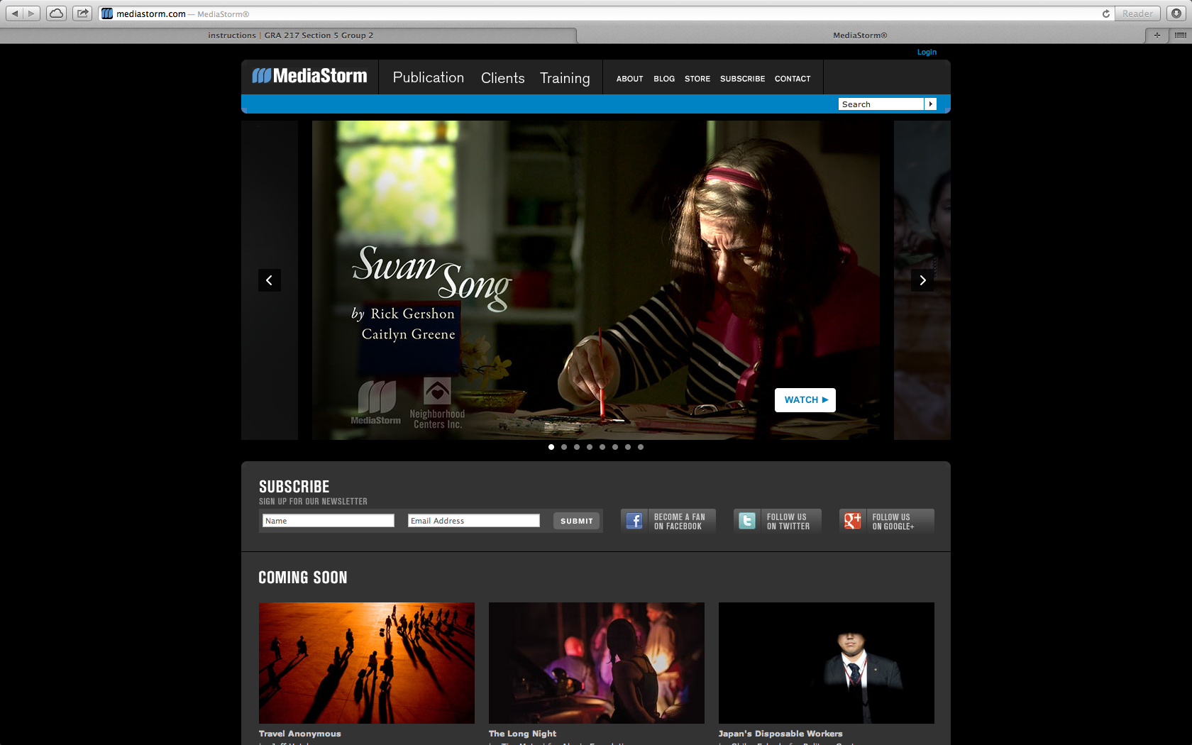
I chose Media Storm as a ideal site that uses photography to draw in an audience. The website is a place to display media and showcase photography. Here they use a key frame to draw the audience into the site and click on the video to see the story. The audience is for everyone, but probably mostly for other content creators to see what others are doing in the field. In this case the key frames in the videos are actually the bulk of the content making it user friendly and easy to navigate.


Media Storm is a business that deals with the visual and so it is important they have a strong visually pleasing website. They not only have a nice design to display work but the work they feature is very strong. The photograph of the older woman painting has beautiful lighting and is in the thirds point. It’s beautiful and clean.
The web site does a good job at providing allotted spaces for the videos in an organized, understandable manner. One could argue that it is not only understandable, but the layout is also visually appealing. Photos are used very well to entice viewers to watch the videos and view the visual stories.