
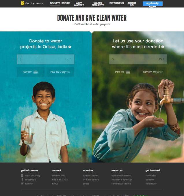
This is the “Donate” page for Charity : Water website. I specifically chose this page instead of the conventional “Home” page because I wanted to to see the organizations use of photography in a page that is the most essential for convincing or persuading audience to take action.
This is the view of the website after I zoomed out three times to get the whole layout of he page. In original setting, the two photos will be bigger than the window itself that I need to scroll down to finish the photo. I love their use of two images of very cute children who serves as the faces of the mission of this organization, and thus very relevant. The use of complementary colors attracts the viewers more to the page and the contents on the photo (donate). Also, the color used for typeface contrasts with the photo that it is very legible. The target audience could be seen as in the wide range of teenagers to seniors. The call-to-action is purposely on the photo so that the message will associate with the beautiful photos, evoking ethos to the audience.
Charity: Water always gives such a face to their website; it’s absolutely wonderful. These kids just look so happy to have the one thing that we all take for granted – water. Putting a face to an organization allows for greater response from the public. These photos are vibrant and characteristic of the audience that Charity: Water is focusing on – the people who are donating money to help these kids, people who want to help out and feel good about what they are doing, for a good cause.
I love the emotion behind the pictures. seeing the smiles of these children warm my heart and ease me into wanting to help out. outstanding photos.