Steve McCurry’s website is an instant draw. All of the photos he uses in his slideshow have excellent use of spot color and have great composition. The elements are all very eye-catching.

Steve McCurry’s website is an instant draw. All of the photos he uses in his slideshow have excellent use of spot color and have great composition. The elements are all very eye-catching.
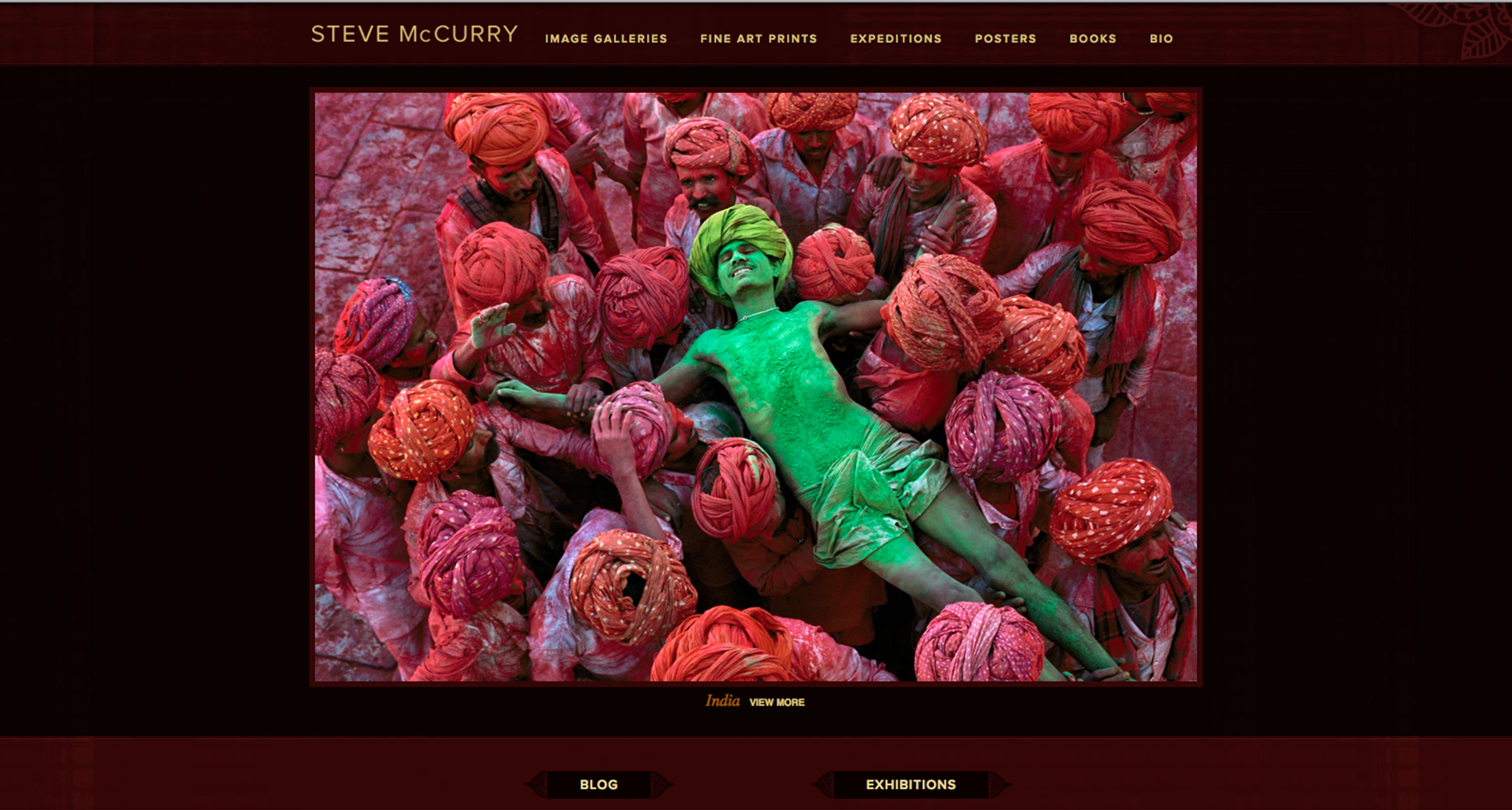
This site is very simplistic, which aids in emphasizing the photos. Especially with the current photo, the reds in the text and site work with the reds in the photo to especially emphasize the subject of the photo — the green man. This site, although seemingly lacking in content, proves that the concept less is more can apply to web design.
This photo is very attractive. The green man and the red ones provides a interesting contrast. I think it works very well in the webpage of McCurry, the famous American photojournalist.