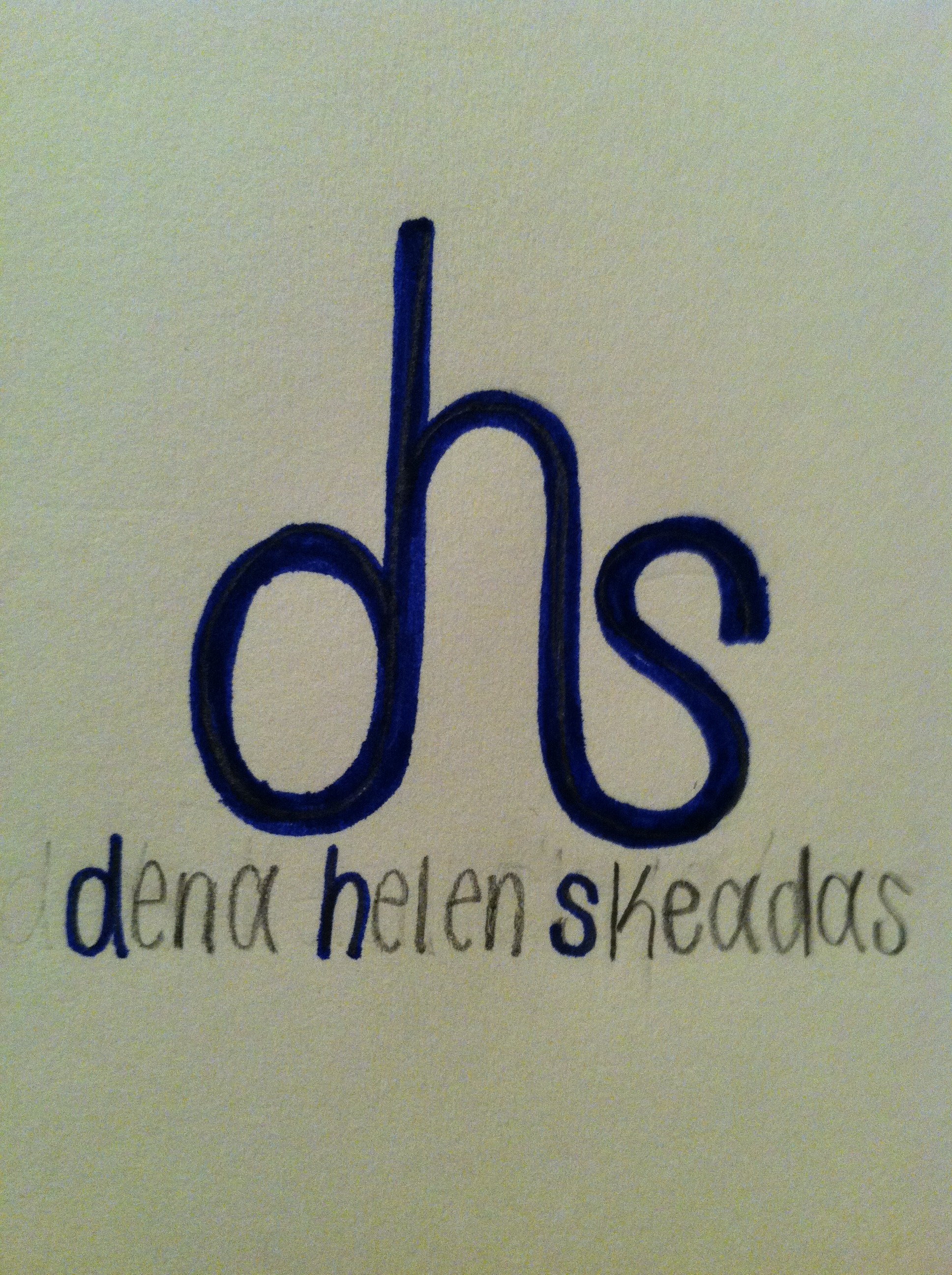
 Above is my personal logo sketch. Behind this design, my thinking process is as follows: I wanted to use all three initials in my name because I think my name is unique and stands out. With this in mind, I wanted to incorporate the “d”, “h”, and “s” together, so this sketch is the way I thought it looked the best. I chose to use lowercase letters because it is the only way I could incorporate the letters together next to one another without flipping them around. I like how the “d” and the “s” are the same size, but how the “h” is slightly bigger. I also like the type is curved; it adds a touch of gentleness. If I were to implement this sketch, I would make the “dhs” a little bolder. I would keep the “d”, “h”, and “s” in the full name the same blue color as the initials above it. Then I would make the remainders of my first, middle and last name white. Blue and white are Greek colors, and if you couldn’t tell from my name, my name is Greek.
GRA 217 Section 5 Group 2
The official blog for GRA 217 with Sherri Taylor

I like the thought process behind your design. I think it is very clever how you combined the letters. If you were to implement this sketch, I don’t think you should make the initials bolder… I think if they were bolder it would be overwhelming and heavy feeling. It is a nice simple design and as prof. Taylor stated “the simplest logos are the best logos.”
I really like your logo. It is a clever and elegant design. I appreciate the meaning in the colors you chose. I like the idea of bolding the initials because I think it shows what you find to be the most important element of your logo.