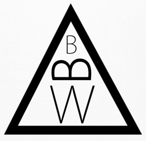
My personal logo includes my initials, BBW, which stand for Bridget Bohannon Williams. I placed them in a triangle simply because that is my favorite shape. I flipped the middle “B” and made it bold just for stylistic purposes. I was really going for simplicity with clean, straight lines. It is black and white to again keep it simple. I created my logo on Photoshop. I have incorporated my logo into my website in the header and favicon. bridgewithat.com
GRA 217 Section 5 Group 2
The official blog for GRA 217 with Sherri Taylor


Bridget, I like the simplicity of this logo. I also like the black and white. But I don’t understand the significance of rotating the second “B” on its side. Maybe you could put the “B”s standing upright, but back to back? And then put the “W” below them? Just a suggestion.
I like the simplicity of your logo and the silhouette colors as well. The triangle adds a pleasing sense of equilibrium, which is an important Gestalt principle. The only suggestion I would make, is to unbold the second B. I think to stick to your simplicity idea it would be best to keep all the letters the same stroke size. Overall, this is a very eye-catching logo that applies the Gestalt principles well.