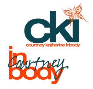
I created my logos on photoshop – seemed easier. Yes, I have a thing for butterflies. Yes, I have a thing for bright orange and turquoise-y blue. Therefore, here you go! I like the simplicity of combining the letters with tight tracking, and I have always been drawn to lowercase letters – they seem more inviting. I think I like the bottom one better, because the i and b are attached, and allows for the creativity of my last name and my personality to come out. Both of these would be put on a vertical business card, if anyone was wondering.
GRA 217 Section 5 Group 2
The official blog for GRA 217 with Sherri Taylor


I really like the top design. I think the bottom one is a bit confusing at a first glance. But very creative with the second one–color and font styles work well together. The butterfly is very cool as the dot for the “i”, but also as an added mark of personalization.
Honestly I like both! I think the orange really works very well in both designs. I love the idea of making tight tracking, which makes the overall design look concise and powerful. But I also agree with Sarah that the second one looks a bit confusing — I can’t get why you are making the two parts (“inbody” and “Courtney”) overlap. That being said, it still looks fun and creative. Just wanna understand better.