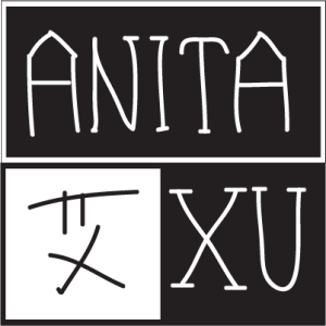
[This is just a sketch.]
Black and white is my favorite color combination, which suggests simpleness, classics and a bit seriousness, as my major journalism requests.
Coming from China, I’m always looking for a way to showcase my bilingual writing skill, which I found could be perfectly revealed in this logo — I put both my English name (Anita Xu) and my Chinese first name (bottom left) here. Also, black and white indicates the Chinese philosophy of “yin and yang,” something that powerfully controls the balance of nature. Literally, “yin” could represent female and anything that’s slow and soft, while “yang” representing the opposite. With three quarters in black (“yin” being overwhelming in this case), this logo also corresponds to my gender.
I’m keeping looking for typefaces that will work well with the information I wanna transmit — probably something genuine, classic and a bit ancient.


I really like your logo! The typeface looks hand-drawn so it gives fun, casual look. However, at the same time, the clean-cut geometric square and black and white color being used gives it a sense of professionalism. Thus, through this logo, you are portraying both fun aspect and professional aspect, which can never be bad.
Personally, I think that you could use your Chinese name as your logo in itself, and then whatever you are working with (in terms of a business card), you could put your English name and go from there. The different forms of your name is very creative, and it’s definitely a conversation starter – which is great in the business world.