
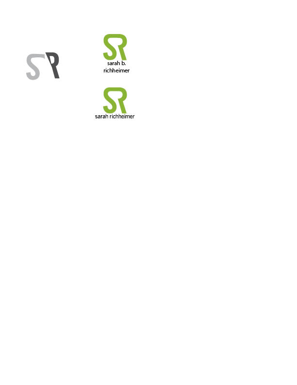
These are my two ideas for a logo for myself. I used the bottom one as my word mark/initial mark on the resume, too. I think it could work well on a business card too. I had trouble incorporating both letters in my name because I have awkward letters that don’t work together too well, but I figured it out! My favorite color is lime green, so that’s why I created my initials using it. Also, I think the middle, between the s and r, you almost forms a letter b, which is my middle initial.
I like the lime green one. I think it’s very creative! I believe the color lime green will work very active and energetic on paper, too. I’m thinking maybe you could extend the tail of “s” to make it even more creative and vivid. For example, to create an extension that looks like its flying or something (up direction makes people feel happy haha). Or you can also do so with the letter “r.” Just personal idea. 🙂
I believe the lime green one is the strongest of the two. I too had trouble combining my initials (at least in a creative manner). You certainly made the two letters your own by removing certain parts of the R, which makes it provocative. The color also helps it stand out. I suggest finding a way to utilize the opening you create with removing part of the R. The current opening makes me analyze it in hopes of finding an image.